Small Interiors
The Tiny-Room Mistakes That Quietly Ruin Daily Life
The worst small-room problems are ordinary and repeatable: blocked paths, stranded storage, competing focal points, and layouts that never reset. Diagnose the friction before buying the fix.
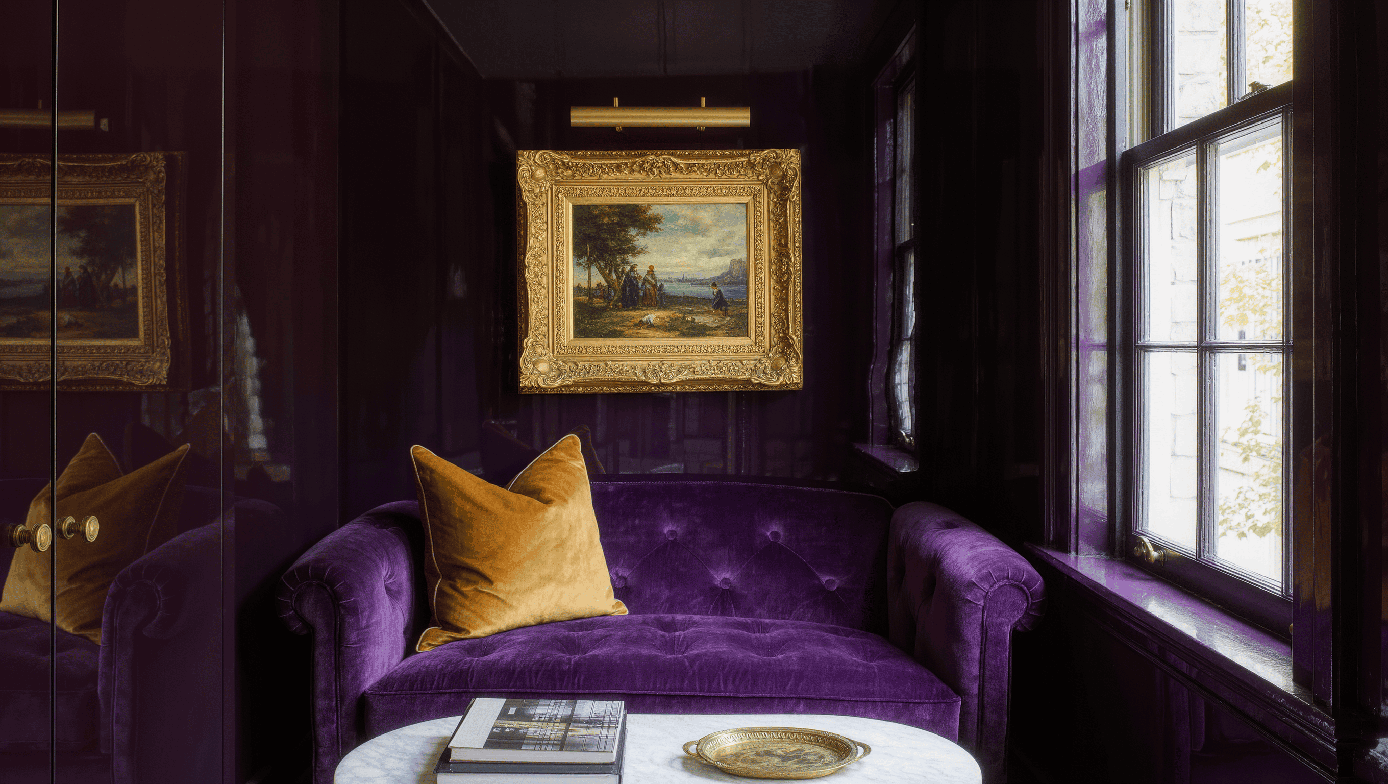
Tiny rooms rarely fail because they are tiny. They fail because every inch has been assigned without deciding which inches matter most.
The damage is quiet. A chair must move before a cabinet can open. A bag lands on the floor because its storage lives across the room. A table is technically useful but makes every path feel like a negotiation. Nothing looks catastrophic in a photograph. Daily life still becomes harder.
These are not decorating misdemeanors. They are operating failures with excellent camouflage.
01
Paths over walls
Protect the routes people use instead of pushing furniture to the perimeter.
02
Behavior over category
Choose furniture for what the body does in the room, not what the room is “supposed” to have.
03
Hierarchy over noise
One dominant visual idea beats six competing ones.
04
Evidence over guessing
Test the change for days before buying anything permanent.
Small rooms don’t need every object to be tiny. They need every decision to be accountable.
01 Diagnosis
Where the room quietly loses the plot
1. Preserving every possible path
Small rooms often become weak because furniture is pushed against every wall to preserve a vague open center. The result is not spaciousness. It is a perimeter of unrelated objects with no strong activity zone.
Better rule: protect the paths people actually use, then let the primary activity claim a meaningful area. A room needs intentional circulation, not diplomatic immunity for every strip of floor.
2. Choosing furniture by category instead of behavior
A room “needs a sofa,” so a sofa is purchased. But the household may use the room to read individually, work on a laptop, host one friend, and watch a screen from different angles. A conventional sofa may be the wrong answer even if it fits the wall.
Better rule: describe the behavior first. Choose the piece that supports the body positions, duration, access, and reset the room requires.
3. Treating compact furniture as automatically efficient
A small item is not efficient if it cannot perform the job. Tiny desks collect overflow. Narrow cabinets hide unusable depth. Delicate side tables force drinks, books, and devices onto the floor.
Better rule: measure useful surface, reachable storage, operating clearance, and capacity—not just the external footprint.
4. Placing storage where space exists instead of where use happens
An empty wall invites a cabinet. But if the cabinet is far from the activity it supports, objects migrate back toward the activity and remain visible.
Better rule: storage belongs at the point of use or along the natural reset path. Convenience is part of capacity.
5. Giving every object equal visual authority
Small rooms become visually noisy when the rug, art, shelving, upholstery, window treatment, lighting, and accessories all demand attention. The eye has nowhere to settle, so the room feels more crowded than it is.
Better rule: choose one dominant visual idea, one supporting rhythm, and a quieter field. Hierarchy creates breathing room.
02 Follow-through
Where good instincts still go wrong

6. Buying “multipurpose” furniture with no reset plan
A table can be dining, work, craft, and game space. That flexibility is useful only if the room can switch modes without moving a day’s worth of objects from one temporary pile to another.
Better rule: every secondary function needs a defined setup and a complete reset. Storage, power, seating, and cleanup are part of the design—not the backstage crew.
7. Ignoring the doorway view
The first sightline often determines whether a room feels calm or congested. A large furniture back, tangled cords, an overloaded shelf, or the side of a storage unit can make the room feel blocked before anyone enters it.
Better rule: photograph the room from the doorway. Decide what should be understood first. Use that view to control scale, focal point, and visual interruption.
8. Solving wall space while ignoring body space
Floor plans can show that furniture fits without showing whether knees, elbows, doors, drawers, and bodies can use it comfortably.
Better rule: test furniture in motion. Open the drawer. Pull out the chair. Carry a laundry basket through the path. Sit down while another person passes.
9. Making permanent purchases before temporary tests
A room is measured, a product is ordered, and only then does the household discover that the new arrangement creates a different problem.
Better rule: tape the footprint, move an existing substitute, use boxes for volume, and live with the proposed change for several days. Evidence is cheaper than returns.
10. Fixing symptoms in the wrong order
New organizers arrive before the room’s job is defined. New lighting arrives before the furniture position is settled. Art is hung before the focal hierarchy is clear.
Better rule: use this sequence:
- define the room’s job;
- protect essential circulation;
- place the primary activity;
- resolve light and power;
- locate storage by use;
- establish visual hierarchy;
- add supporting details last.
03 Field test
The three-day friction check
For three days, record every time you:
- move an object to use another object;
- walk across the room to retrieve or return something;
- block a path, door, drawer, or seat;
- create a temporary pile;
- avoid an activity because setup feels annoying;
- feel that the room is visually loud even when it is tidy.
The repeated friction is more useful than a general feeling that the room is “too small.” It identifies the governing conflict.
Where this observation stops: these methods address layout, furniture behavior, storage logic, lighting use, and visual hierarchy. They do not establish structural safety, electrical capacity, code compliance, or accessibility requirements. Stop and seek qualified guidance when the intervention reaches those systems.
The verdict
Make one decision answer for itself
A tiny room does not need every object to be tiny. It needs every decision to be accountable.
Circle the friction that repeated most often during the check. Test one reversible change against it before buying anything. The room does not need a dramatic reveal; it needs one conflict to stop running the floor plan.


