Function and Flow
Corey Damen Jenkins: Refined Maximalism Still Needs a Floor Plan
Corey Damen Jenkins is useful to study because his maximalism is supported by a disciplined skeleton: architecture, layout, repetition, scale, tailoring, and editing.

Corey Damen Jenkins gets described through color, pattern, glamour, and refined maximalism. All true, and none of it explains why the rooms actually hold together. The real reason is structural: decorative energy sits on top of legible architecture, clear furniture groups, and repeated color — abundance with a skeleton, not a pile with excellent upholstery.
One piece of biography is worth more here than another adjective for the palette. Jenkins opened his firm in 2008, into a recession, in a metro Detroit market that had largely stopped commissioning anything. Business of Home has the number: he knocked on 779 doors. The 779th let him in and hired him; the finished project was photographed, and two weeks later an HGTV producer called. That is the behavior of somebody who has concluded the normal referral pipeline is down and has gone looking for the path that still carries traffic. The residue of that is visible in the rooms. The decoration is allowed to be confident because whatever is underneath it has already been made to prove itself.
The plan comes before the jewelry
Maximalism usually fails because decoration gets asked to create order after the floor plan already gave up — a sofa group with no clear center, circulation cutting through the seating, a rug too small, and then more color and pattern recruited to distract from the spatial confusion. Jenkins’s stronger rooms reverse that: architecture sets the large rhythm, furniture creates understandable zones, and only once that skeleton is clear does the decorative layer get adventurous. Before adding another patterned object, draw the route through the room and find the primary furniture group. If either is unclear, the room isn’t waiting for another print.
Symmetry and classical proportion do real work here, too — they stabilize a room holding a lot of visual information and give the eye a shortcut. Nobody needs a rigid, historically correct room to get the benefit; recognizable order simply creates permission for surprise. A vivid color or aggressive pattern feels more deliberate when the room around it has a clear framework. Structure is frequently the thing that makes the drama believable.
Color and pattern need a hierarchy, not a headcount
A richly colored room holds together through recurrence — a dominant hue showing up in upholstery, trim, art, and a second textile, not matching exactly but creating a thread. The weak version is one bright object acting as the room’s personality hire; the stronger version lets color travel through the space at different scales so it feels embedded. A useful test: name the room’s two most important colors, then check whether each appears in more than one place without forcing the search.
Rank the patterns; counting them is a distraction
A room gets noisy when every pattern arrives at the same size and contrast — don’t count patterns, rank them. Which one leads, which one supports, which one behaves almost like texture? Crisp edges and tailoring matter for the same reason: abundance needs precision somewhere, and a saturated wall reads as disciplined when the molding and architectural lines stay legible underneath it.
Maximalism is a reason to edit harder
Refined maximalism is easy to ingredient-shop: more pattern, more trim, more metallic finish, more art — and suddenly the room is richly furnished but spatially illiterate. I would not copy the quantity. I’d copy the control: a clear plan, a dominant color relationship repeated at more than one scale, varied pattern hierarchy, and enough quiet surface to let the strongest elements actually register. Maximalism is not permission to stop editing. It’s a reason to edit harder.
If you want the cheapest possible version of this, look hard at the rug before you buy anything else. A rug that is too small is the single most common reason a richly furnished room reads as chaos rather than abundance, because it quietly tells the eye that the furniture group has no boundary. Everything you add afterward is then trying to supply a boundary that a textile was supposed to draw. That is a hundred-dollar problem people routinely solve with three thousand dollars of new objects.

Source: Corey Damen Jenkins’s interiors portfolio and studio background, including its stated client-centered approach; his book “Design Remix: A New Spin on Traditional Rooms” (Rizzoli, foreword by Jamie Drake); Business of Home’s account of the 779 doors he knocked on in 2008.
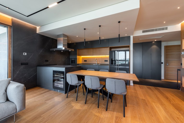
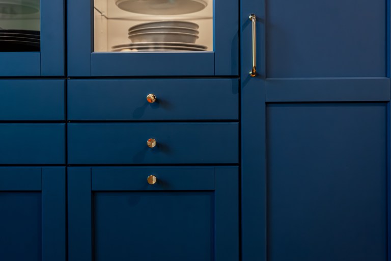
Designer study. This concise study is part of Designers Worth Studying, the deeper Room for Drama index for what to borrow, what not to copy, and how each idea survives an actual room. Photographs in this series are Room for Drama’s own illustrative images, not photographs of the designer’s projects.
Same problem, elsewhere in the house
Room notes
Keep the room on the record.
One useful note at a time: what to test, what to ignore, and what changed when the room got another vote.