Light and Atmosphere
The Living Room That Keeps Its Cool Until Midnight
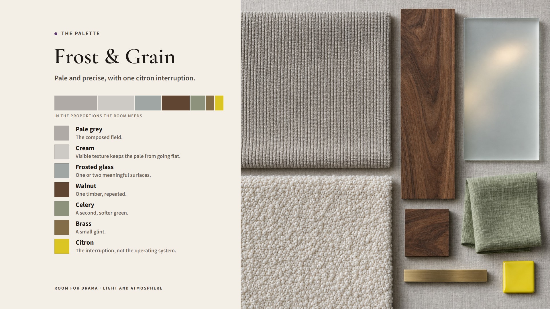
A polished full-build room in frosted glass, celery green, citron, cream, walnut, and brass—designed for clean sightlines, easy circulation, and a mood that warms as the evening progresses.
On this page
15
Some rooms arrive wearing a blazer and spend the rest of the evening looking for an excuse to loosen it. That is the energy here: pale gray, cream, citron, celery green, walnut, frosted glass, and brass arranged with suspicious precision, then softened by people, music, lower light, and the inevitable glass left somewhere it was not technically invited.
A palette like this is easy to stage for one night — Tangled Thistle has a whole Atmosphere Library of evenings built that way. The harder question is what the same room does every day: low visual lines, controlled contrast, easy movement, and enough warmth to keep all that pale glass from behaving like a private clinic.
What the Room Is Trying to Do
This scheme works best when the room needs to feel composed by day and more intimate after dark. The trouble is that pale upholstery, translucent surfaces, and precise furniture go sterile fast, and a sterile room at eleven at night is a waiting room with a nicer lamp. The room therefore needs three counterweights: warm timber, visible texture, and one dark line strong enough to give the eye somewhere to stop.
Citron should be the interruption, not the operating system. Use it where the eye needs a jolt: one chair, a lacquered side table, a cushion, a line in artwork, or the interior of a cabinet. Spread it everywhere and the room begins issuing safety vests.
What the Architecture Has Already Decided
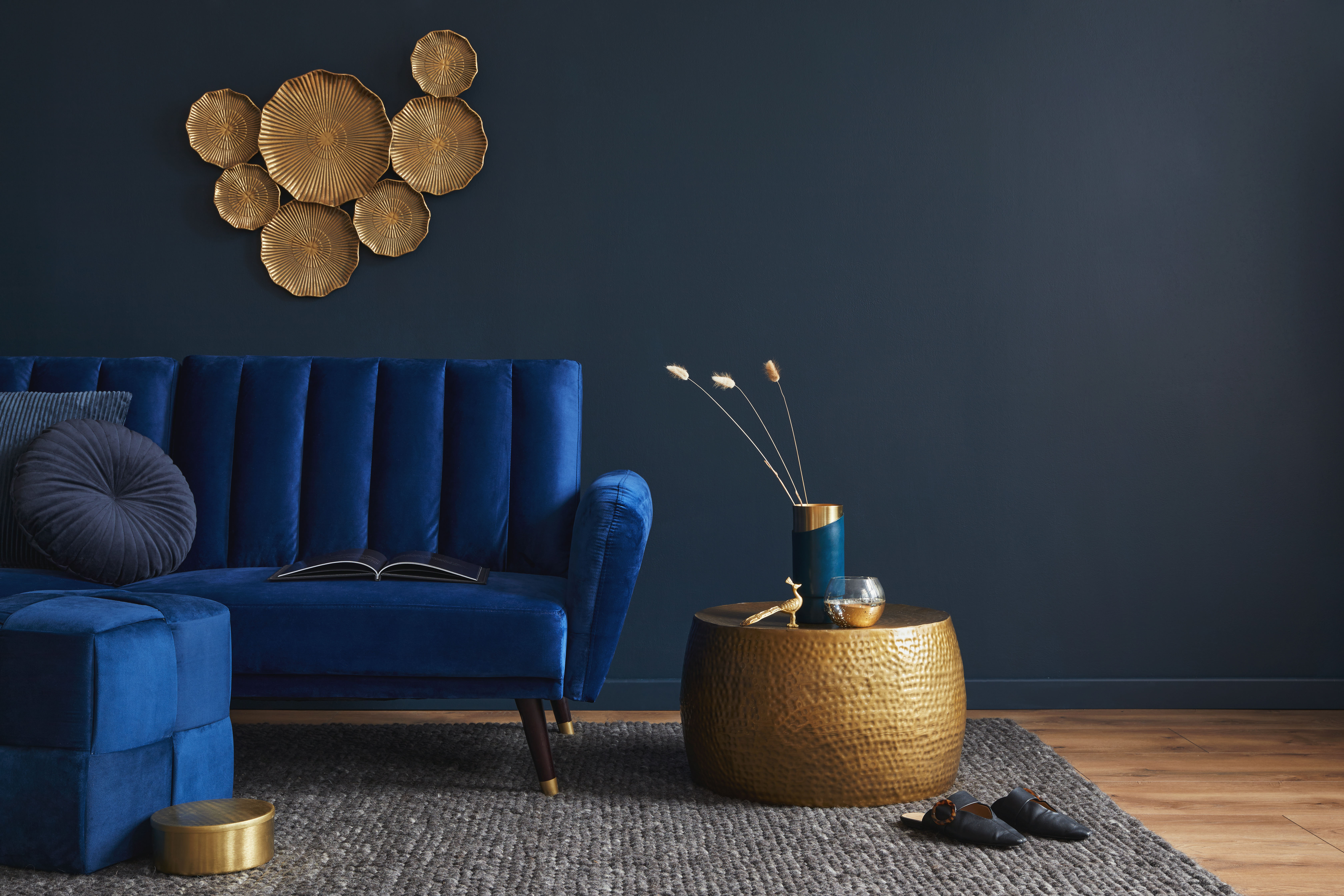
The concept is naturally suited to rooms with strong horizontal features: low windows, long walls, built-in benches, broad hearths, or a change in floor level. Those elements already pull the eye sideways, so low furniture lines up with something instead of floating.
In a flat, conventional room, create the same effect with one long storage element, a generous rug, wall-mounted lighting, and furniture whose visual weight stays below the main sightline. Do not lower every seat. A room can read as horizontal without asking everyone’s knees to participate.
If the floor genuinely changes level, safety outranks nostalgia. Step edges, lighting, circulation, accessibility, and local requirements need professional review. A conversation pit that works only in photographs is merely a hole with good publicity.
Leave the Middle Open and Let the Weight Sit Around It
Keep the center visually open and place the room’s weight around it.
That does not mean pushing every object against a wall. It means arranging the largest pieces so the main route does not cut through the conversation. A sofa can sit along one side, a bench or credenza can extend the horizontal line, and smaller chairs can turn toward the group without blocking the path.
Test the route with the room in use. Can someone enter carrying a tray? Can a seated person stand without moving the table? Can a door, drawer, or cabinet open while another person passes? The correct clearance is the one that supports those real actions, not a number borrowed from a room with different furniture and different bodies.
Where the Drama Belongs
Let the drama live in the contrast between frost and grain. Frosted glass diffuses light and obscures cluttered outlines. Walnut or another warm mid-tone timber brings grain, depth, and human scale. Brass provides a small glint. Citron supplies the nerve.
Use frosted glass for one or two meaningful surfaces: cabinet fronts, a lamp shade, a partition, an internal door, or a side table. Its job is to soften light and create depth, not to make every object look refrigerated.
Choose one primary timber tone and repeat it across a console, shelving, chair frame, or wall panel. Several unrelated orange and brown woods will make the room feel accidental rather than layered.
For upholstery, favor materials with visible structure: ribbed fabric, brushed cotton, wool, linen blends, matte leather, or a restrained geometric weave. These surfaces keep the pale palette from becoming flat without introducing a pattern that competes with the glass.
How the Space Changes After Dark
During the day, filtered natural light should reveal texture and transparency. Direct glare against frosted glass can flatten it, so use shades, curtains, or translucent panels where the sun is harsh.
At dusk, turn on wall washes, frosted lamps, and low task lights before the room becomes dark. This transition matters. A pale palette needs gradual warmth, not one overhead fixture snapping the whole room back to noon.
After dark, combine dimmable ambient light, low lamps at or below seated eye level, and directional light on art, shelving, or a textured wall. Keep the light warm enough to flatter timber and skin, but not so amber that celery green turns beige.
If the room contains a television, keep reflective glass outside the strongest screen angles and introduce soft light behind or near the screen. A pale room will announce glare problems with great confidence.
Low Furniture Without the Rescue Operation
Low silhouettes create the lounge effect, but seat height, depth, firmness, and arm support still determine whether the room works. Pair a lower sofa with at least one chair that is easier to enter and leave. In a shared or multigenerational room, that more supportive seat is not a compromise. It is part of the plan.
Tables should feel visually light but remain legible. Rounded edges and visible bases are safer than an almost invisible glass slab floating at ankle height. The coffee table should support drinks, books, and movement without becoming a transparent obstacle course.
Where the Clutter Is Going to Live
This room depends on clean sightlines, so loose objects become conspicuous. Use one coherent storage element rather than several small cabinets competing along every wall. A long credenza, low built-in, or wall of closed storage can contain electronics, chargers, games, blankets, paperwork, and the objects that tend to colonize a living room by Thursday.
Frosted doors work for items that need visual softness but not complete concealment. Opaque fronts should handle cords, routers, batteries, manuals, and the remote nobody admits belongs to anything.
Plan power before final furniture placement. Integrated charging, cable channels, concealed raceways, or appropriately located outlets matter because the room’s clean geometry makes stray wires look especially mutinous.
Plants Should Hold Space, Not Fill It
Use a few plants with clear silhouettes rather than a collection of tiny pots. A tall plant can hold a corner or soften a partition. One trailing plant can relax a shelf. Repeated containers in cream ceramic, dark stone, green glass, or brushed metal will make the planting feel integrated rather than rescued from several unrelated windowsills.
The Clever Build Sequence
Observe first. Note daylight, glare, circulation, screen reflections, and where people naturally sit.
Set the route. Establish the main crossing path and conversation zone before choosing decorative objects.
Solve infrastructure. Address switching, dimming, power, data, audiovisual needs, and any step lighting before adding furniture that conceals access.
Then place the visual weight. Install the sofa, primary storage, and rug, and test movement before adding smaller chairs and tables. Layer light after that, testing the room during the hours it will actually be used, especially dusk and evening.
Frost, metal, and color go in last. These are accents with strong visual consequences. They should sharpen a functioning room, not distract from a weak plan.
Three Levels of Commitment
The Reversible Test
Open the center, move one low table out of the main route, add a frosted-glass lamp, repeat muted green in two places, and introduce one dark contrast. Live with the arrangement in daylight and after dark before buying anything substantial.
The Considered Refresh
Add a larger rug, improve upholstery, introduce one coherent timber storage piece, correct cable management, and add proper wall or floor lighting. Spend first on the elements that improve daily use, not on the citron object everyone will photograph.
The Architectural Version
Built-in seating, permanent partitions, new glazing, floor outlets, altered levels, acoustic treatment, and fixed lighting require appropriate professional design and code review. Those interventions can deepen the idea, but they also increase cost, maintenance, and irreversibility.
What Would Ruin It
Too much frosted glass flattens the room. Too much citron turns it into branding. Too much low furniture makes it inaccessible. Too much brass makes it themed. Too little contrast creates the tasteful-refrigerator problem.
The antidote is hierarchy: one pale base, one warm timber, one green family, one dark line, one bright accent, and one or two surfaces that catch light.
Test the Attitude Before Building the Whole Room
Create one controlled corner first: a timber side table, a frosted lamp, a cream chair, one celery cushion, one citron object, and one charcoal or black contrast. Use it in daylight and after dark.
If it feels calm by day and persuasive at night, expand the scheme. If it feels like a corporate lounge waiting for name badges, add texture, warmth, and something slightly imperfect.
The final room should look composed enough to suggest discipline and comfortable enough to survive actual people. By midnight the blazer should be off, somebody’s glass should be sitting on the frosted cabinet, and the room should look better for it.
Same problem, elsewhere in the house
Room notes
Keep the room on the record.
One useful note at a time: what to test, what to ignore, and what changed when the room got another vote.