Light and Atmosphere
Pacific After Dark: Build an Ink, Salt, and Meyer-Lemon Room for Everyday Life
Build an ink, salt, and Meyer-lemon room with deep blue-black color, mineral pale surfaces, citrus accents, warm metals, and controlled lighting—without turning it into a theme set.
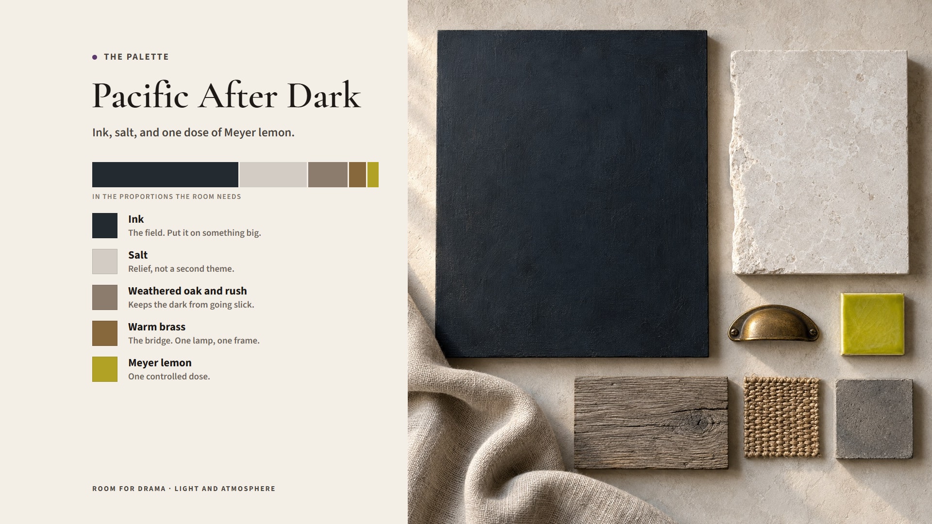
Pacific after dark is not a nautical theme. No rope required.
The useful design translation is contrast: ink-deep color, salt-pale mineral surfaces, one acidic yellow note, weathered texture, and warm light that keeps darkness from becoming flat. The room should suggest coastline, night air, citrus skin, and mineral light without turning any of those references into props.
Let ink be the field
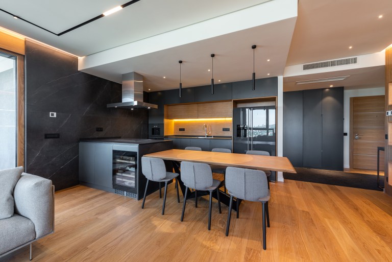
Put the deep blue-black, the charcoal-navy, or the near-black green on something large enough to matter: walls, cabinetry, a sofa, a curtain that runs floor to ceiling. Scale is the whole trick. Spread across a dozen small objects, the same color reads as a collection of dark accessories. On one big surface it reads as weather.
Test big samples in the room itself, not in the store and not on a phone screen. A blue-black goes green, violet, gray, or flatly black depending on the daylight, the floor it sits above, and the temperature of your bulbs. And judge it at the hour you actually use the room, which for this palette is after dinner.
Use salt as relief, not as a second theme
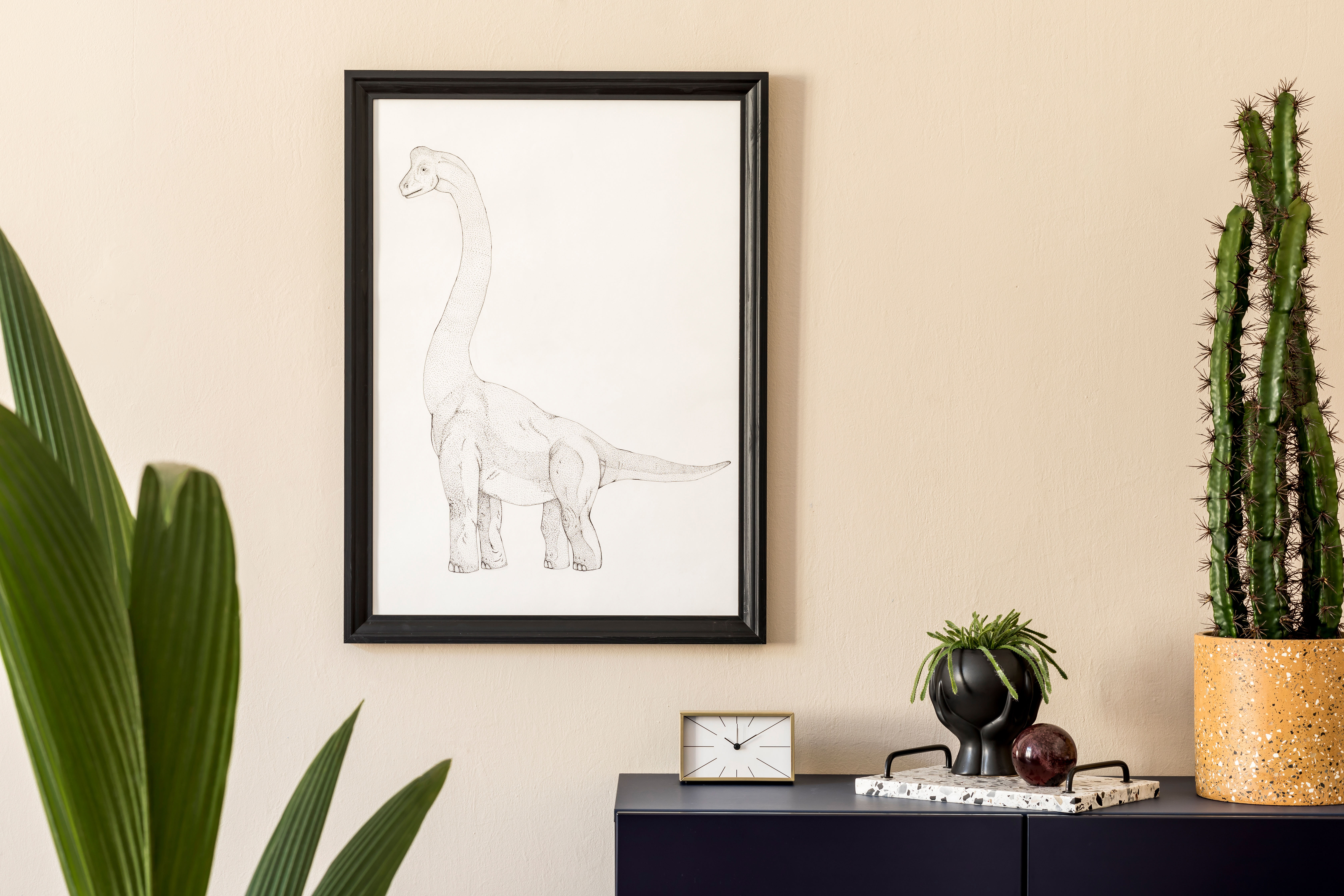
Pale plaster, chalky stone, linen, unglazed ceramic, limewash, matte paint: any of these gives the ink somewhere to breathe. Keep them mineral and a little imperfect. Glossy white against a dark field does not read as salt. It reads as a bathroom.
Nobody said fifty-fifty. A dark envelope with one pale sofa and a stone table is plenty. And the whole thing inverts happily: pale walls, one deep cabinet, a dark rug, a heavy curtain, and the room still reads Pacific.
Add Meyer lemon in one controlled dose
One yellow-green cushion. A piece of art. A glass object catching a lamp. A flowering branch. That is the dose. One or two precise hits read as intent; the same yellow repeated across every cushion, vase and tray turns the room into branding.
Put the yellow where you want people to look. It will pull the eye to a reading corner, to the art, to the far end of a long room. That is its job: one electric interruption in an otherwise quiet field.
Give the yellow enough contrast to matter
Surround the accent with three other saturated colors and it stops being an accent. Keep its neighbors quiet and the acid note stays the thing the eye finds first, every time, from the doorway.
That does not require a neutral room. Burgundy, olive, rust, or deep teal can coexist with citrus if one color clearly leads and the yellow remains the spark rather than joining a committee.
Bring in weathered material
Wood grain, woven fiber, aged metal, handmade ceramic, rough stone, a fabric with some tooth. These are what keep a dark room from going slick. They suggest exposure and use, which is what the coast actually looks like, without any of the beach-house shorthand.
Mix the finishes so light lands at different depths across the room. Matte paint beside glazed ceramic. Wool beside brass. Honed stone beside glass. Material contrast buys more depth in a limited palette than any additional color will.
For more on how finish changes a room, continue to Material Stories.
Use black as depth, not as a hole
Very dark surfaces need an edge and something to catch. A black cabinet against a dark wall with nothing lighting its profile simply vanishes. A black table on a dark rug loses its silhouette entirely, and then somebody puts a glass down on the floor.
Give every dark form a readable boundary: a change of texture, a shift in sheen, a pale object beside it, a light aimed across it. Darkness is strongest when you can still tell what each object is doing.
Light the surfaces first
Aim warm lamps at the textured wall, the art, the shelf, the plant, and the materials start doing their work. A dark room needs layers, not wattage. Give reading, serving and working areas honest task light first, then build the perimeter out of softer sources.
Keep the glare off faces and the routes legible after dark. Respect fixture ratings, and get a qualified electrician for anything fixed. A room is allowed to be moody. It is not allowed to make guests navigate by instinct.
Explore Atmosphere for the larger relationship between light, sound, texture, and mood.
Use brass or warm metal sparingly
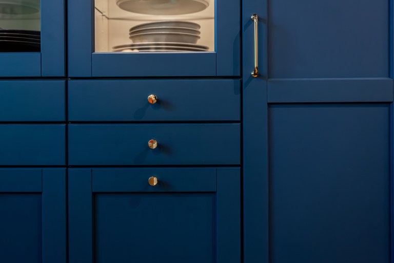
Warm metal is the bridge between the ink and the lemon. It catches amber light and contributes a quieter yellow of its own. One lamp, one frame, one family of hardware, one detail on a table. That is usually the whole allowance.
Too much polished metal and the palette stops being atmospheric and starts being a hotel lobby. Let the metal flash occasionally. Do not let it become a third field.
Keep the coast abstract
No shells. No rope, no anchors, no lemon motifs, no blue-and-white just because the words matched. The reference lands harder when it is carried by proportion, temperature, texture and light than when it is carried by objects that announce it.
Ink, salt, and Meyer lemon work because each plays a different role: depth, relief, and interruption. Let those roles stay clear and the palette can move from bedroom to dining room to lounge without becoming a costume.
Translate the palette by room
In a bedroom the ink becomes the envelope and the salt lives in the bedding. In a dining room, keep the walls pale and let the dark arrive as the table and the curtains, with the citrus concentrated in art or a single piece of glass. In a lounge it is an ink sofa, a mineral rug, one yellow chair. Same logic, different proportions.
The palette is a relationship, not a paint-by-number schedule. Change the proportions to suit the light, room size, and function.
Test the room after six
This palette lives or dies after six. Kill the overhead, switch on the lamps you would genuinely use on a Tuesday, and look. Either the dark surfaces gain dimension or they go flat and swallow the room.
If it loses shape, light a surface or introduce one lighter material before you touch the paint. If it tips into theatrical, pull back the reflective accents first. Lightening the whole palette is the last resort, not the first.
Weather, not theme
Get this right and the room reads as a condition rather than a destination. Deep color provides atmosphere, mineral relief keeps it breathable, citrus wakes the composition, and warm light makes the materials visible enough to matter.
Use the coast as a design condition, not a souvenir shop.
Same problem, elsewhere in the house
Room notes
Keep the room on the record.
One useful note at a time: what to test, what to ignore, and what changed when the room got another vote.