Furniture and Scale
The Clock Has Taken the Wall
A design-intelligence reading of a dramatic industrial lounge—and a practical method for building a room around one impossible-scale object without letting the rest become costume scenery.
On this page
24
Room Edit · Monumental Focus / Industrial Warmth / Collected Drama
How to build a room around one impossible-scale object — without letting the rest of the space wander into costume scenery.
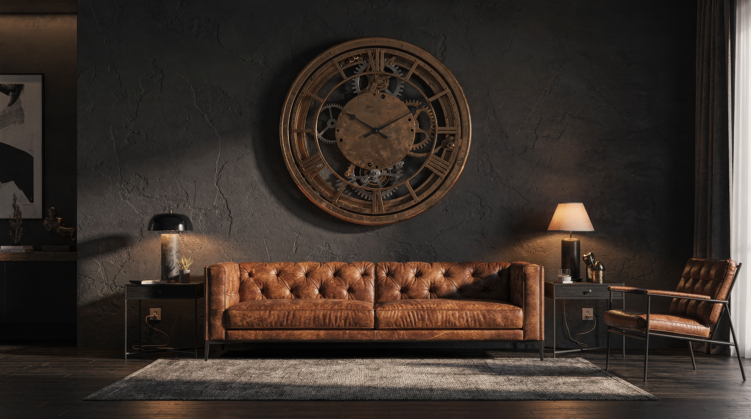
Room for Drama editorial still. AI-generated specifically to show a residential lounge organized around one monumental wall clock as the dominant hierarchy piece; not a completed Room for Drama project.
The first read
This is a room governed by time, and the large clock is only the announcement.
The distinction matters. A large accessory occupies space; a governing object reorganizes it. Here, the clock claims almost the entire vertical field above the sofa. Its circular face establishes the primary geometry, its Roman numerals provide scale, and the surrounding gears extend the idea beyond the clock’s edge. The sofa does not compete. It acts as a deep, low plinth: brown leather, rolled arms, tufting, and enough visual gravity to keep the wall from appearing to float away with the plot.
The result is theatrical, but the theater has discipline. The eye lands on the clock, travels through the smaller circles, drops into the sofa, crosses the table, and settles into the rug. Window light enters from the left and warm lamplight answers from the right. Brick, dark metal, wood, leather, and aged-gold tones all speak different dialects of the same material language. Even the plant has a job: it interrupts the machinery with something alive, asymmetrical, and entirely unconcerned with Roman numerals.
This is the central lesson of the room: drama takes orders. One element leads. A few elements translate. The largest furniture stabilizes. Light edits the scene. Everything else either strengthens that order or needs to leave before it starts auditioning.
What the room is actually doing
The room succeeds by controlling five kinds of pressure.
Visual pressure: the clock is enormous, detailed, and high-contrast. The room relieves that pressure with a comparatively quiet sofa silhouette and a broad rug field. Without those calm horizontal masses, the wall would feel feverish.
Material pressure: exposed brick, blackened steel, coppery metal, brown leather, dark timber, patterned textile, glass, and foliage could become a catalog of rugged things. They remain coherent because the palette is narrow and every hard surface is balanced by something absorptive, worn, or soft.
Scale pressure: the clock is intentionally beyond domestic scale. The Chesterfield, broad coffee table, tall window, substantial ceiling structure, and generous wall width answer it. Tiny furniture would make the centerpiece look less grand and more accidentally delivered to the wrong address.
Narrative pressure: gears, gauges, mechanical parts, exposed services, old forms, and dark metal suggest a world. The room avoids complete surrender to theme because recognizable living-room functions remain clear: sit, set down a drink, read, talk, look out the window, turn on a lamp.
Atmospheric pressure: the room is dark, but it is not visually sealed. Daylight, reflective metal, warm lamps, lighter rug motifs, and the green plant keep the darkness dimensional. Black is being used as depth, not punishment.
The governing idea
Monumental mechanism, human refuge.
Every memorable room needs a governing sentence short enough to make decisions with. For this one: a monumental mechanism hangs over a deeply comfortable refuge. That sentence explains the clock and the sofa, but it also establishes the tension that makes the image worth studying. The wall is public, intricate, engineered, and almost civic in scale. The seating is private, yielding, familiar, and bodily. One tells time. The other invites you to ignore it.
That opposition is more useful than the label “industrial” or “steampunk.” Style labels tell you which objects to search for. A governing tension tells you why the room feels alive. If you reproduce only the gears, you get merchandise. If you reproduce the opposition (hard against soft, monumental against intimate, exact against worn), you can create a room with the same force using entirely different objects.
The hero could be an enormous relief map, a carved theater fragment, a monumental abstract painting, a wall of botanical specimens, a vintage station board, or one impossible cabinet. The supporting refuge could be linen, velvet, boucle, old leather, or a restrained daybed. The room’s intelligence is transferable. Its props are optional.
Hierarchy
One impossible object. Three echoes. Then stop.
The clock earns dominance through size, contrast, central placement, and detail. Smaller circular objects orbit it: exposed gears below, instrument-like forms to the left, a wheel form at the right. These are echoes, not rivals. They repeat the hero’s geometry at reduced scale and lower contrast, allowing the eye to move without asking it to elect a new government every twelve inches.
The practical rule is severe because rooms benefit from severity at this stage: select one dominant object, permit two or three subordinate echoes, and make the rest of the objects speak in quieter shapes. If every lamp, table, cushion, shelf, and door handle becomes a gear, the room stops feeling collected and begins selling tickets.
Notice that the sofa, coffee table, and rug are primarily rectangular. Their horizontal geometry does not mimic the clock; it frames and grounds it. That difference is what keeps the wall readable. Repetition creates coherence, but non-repetition preserves legibility. A successful theme is never the same noun applied to every surface.
Scale and mass
The centerpiece needs architecture strong enough to disagree with it.
Oversized objects expose weak rooms. A monumental wall piece cannot be made convincing by enthusiasm alone. It needs sufficient wall area, believable clearance, furniture with compatible visual weight, and architectural lines that do not slice it into an awkward remainder. In the photograph, tall glazing, exposed beams, deep ceiling structure, a broad brick bay, and dark framing all support the clock’s scale.
The sofa is what stops the wall from winning. Its rolled arms, deep seat, tufted back, and dark leather create a continuous base across much of the composition. A narrow apartment sofa on spindly legs would leave the clock top-heavy. A pale, sharply minimal sofa could work, but only if another grounded mass—a low cabinet, stone platform, broad table, or very dark rug—restored balance.
Before introducing an oversized object, photograph the empty wall straight on. Tape its actual outer dimensions. Add its depth, not merely its face. Sit in the room and observe the mock-up from the entrance, primary seat, adjacent room, and nighttime lighting. The correct question is not “Does it fit?” The correct question is “Does the room answer it from every place where life actually sees it?”
Spatial sequence
The eye has a route, and so should the body.
The photograph is composed frontally, but the room still reveals a useful sequence: rug defines the occupied zone; coffee table creates a service center; sofa establishes the main destination; clock completes the vertical field. The window edge and right-hand shelving suggest circulation occurring around, rather than through, the seating group. That is exactly what a dramatic focal arrangement needs. If the main walking route cuts between sofa and table, the room’s visual ceremony becomes a daily obstacle course.
A large feature wall attracts furniture toward it. Resist the instinct to push every object against that wall in obedience. Preserve clear entry, comfortable seat access, table reach, window operation, and a route that does not require guests to apologize to a rolled sofa arm. The photograph does not provide measurements, so no clearance is claimed here; in a real room, actual bodies, doors, mobility devices, pets, bags, and cleaning routines must establish them.
The rug is doing more than warming the floor. It declares where the room happens. Its perimeter collects the sofa and table into one scene while the darker floor remains visible as a circulation border. In a smaller room, the same principle can be achieved with a simpler rug and fewer objects: define the occupied island clearly, then let the route read as negative space rather than leftover floor.
Material score
Hard machinery needs surfaces that remember touch.
The material palette is persuasive because it is not uniformly pristine. Brick varies. Leather creases. Timber shows grain. Metal appears darkened, burnished, or aged. The rug carries softened pattern. These surfaces hold light unevenly, which creates depth and makes the room feel accumulated rather than freshly unpacked from a single themed shipment.
There is also a careful alternation of thermal character. Steel and black framing are cool; leather and timber are warm. Brick sits between. Brass and coppery tones catch the lamps. Glass and windows provide brief flashes of clarity. The plant introduces a matte organic surface that cannot be mistaken for another artifact. The room would be less convincing if every object shared the same brown stain or identical faux patina.
When rebuilding this language, choose honest variation rather than theatrical damage. One substantial leather or textile surface, one dark structural finish, one warm timber, one aged or softly reflective metal, and one mineral surface are enough. The goal is material conversation. Ten different “vintage industrial” finishes shouting their backstories at once make a networking event with poor acoustics, and nobody leaves with a single useful contact.
Color intelligence
A dark room still needs a value structure.
The image appears dominated by charcoal, black, brick, tobacco leather, dark walnut, and aged metal. Yet the palette is not one continuous brown fog. Near-black framing creates the deepest value. The sofa occupies a warmer middle-dark. The clock face mixes midtone bronze with lighter numerals. The rug introduces quiet cream and blue-gray notes. Window light and lamp shades provide the brightest points.
A useful working palette: soot black #111413; iron #292D2D; brick ember #6B3B2C; saddle leather #7B482D; oxidized bronze #7A5130; aged brass #B78345; parchment #D7C8AE; and deep leaf #334A38. These are interpretive design colors drawn from the visible mood, not sampled specifications for the photographed objects.
Use the darkest value to clarify architecture and background. Use saddle and brick as the warm body of the room. Reserve brass for small flashes and key details. Keep parchment near faces, books, lampshades, and textile pattern so the room remains hospitable after sunset. Green should feel alive rather than decorative: one substantial plant is more effective than six tiny leaves attempting group morale.
Light
The room needs two kinds of truth: daylight and conspiracy.
Daylight from the tall window makes the dark finishes readable. It catches the clock’s numerals, separates black metal from brick, and gives the plant enough visual freshness to oppose the machinery. A room like this should not depend on darkness to hide weak material choices. If the design only works after sunset, inspect it at noon before buying another bulb.
At night, light should arrive in layers rather than from one central ceiling fixture. The photograph suggests a warm table lamp at the right, a smaller directional light near the window, and overhead accent sources. The most successful version would distinguish four jobs: gentle circulation light, comfortable reading light at the seating, controlled illumination on the focal wall, and a low ambient glow that leaves some depth intact.
Do not blast the centerpiece evenly. Grazing or directional light reveals relief, edges, numerals, and metal variation; flat frontal light can turn an intricate object into a retail display. Avoid glare on glass and polished metal from the principal seat. Dimmers are useful, but the deeper design question is whether each source has a specific role. “All the lights on” is not a scene. It is an electrical confession.
Comfort
The room must survive being occupied by someone without a waistcoat.
The photograph’s furniture reads as physically generous. Deep cushions, broad arms, a reachable table, rug underfoot, and lamps within the seating orbit all argue that the room is meant for lingering. This is what prevents the concept from becoming a museum set. The mechanics may provide the story, but comfort provides the alibi.
A Chesterfield silhouette brings useful visual mass, but tufting, seat depth, arm height, and leather temperature are personal. Test the actual sofa for the people who will use it. If the room serves reading, confirm back support and light placement. If it serves conversation, make sure additional seating can join without facing the hero wall like an audience awaiting a lecture. If it serves television too, resolve that honestly rather than hiding a screen in a sentence.
The coffee table should support the room without sealing the sofa behind a timber barricade. Its height, reach, corners, lower shelf, and route around it matter more than its resemblance to an old workshop bench. A side table may be the wiser move in a tighter plan. Drama does not require bruised shins.
The living interruption
One fern prevents a mechanical coup.
The plant at the left is small compared with the clock, yet conceptually important. Its fronds are irregular where the gears are circular, fresh where the leather and brick appear aged, and responsive where the metal appears permanent. It also softens the bright window edge and keeps that corner from becoming a black frame around empty glare.
Every highly controlled room benefits from one element that refuses the governing geometry. In this room it is foliage. Elsewhere it might be a loose textile, an eccentric ceramic form, a stack of current books, a wildly shaped lamp, or a piece of art with an entirely different tempo. The interruption should be a single choice, not a decorating theme.
This is also where signs of present life belong. The room does not need staged clutter, but it should allow a book in progress, a drink, a folded throw, a pair of glasses, or a game to exist without breaking the composition. A room that can only maintain its identity while unoccupied is a photograph with heating costs.
Failure study
How this becomes a theme park—and how to stop five minutes earlier.
Failure one: everything becomes mechanical. Gear tables, gear mirrors, gear lamps, gear coasters, gear bookends. The cure is geometric restraint: keep the primary mechanism, permit a few echoes, then return to plain rectangles, soft textiles, books, wood, and living forms.
Failure two: every surface receives instant history. Faux rust, distressed brick, rubbed leather, reclaimed wood, antique brass, cracked paint, and sepia art can flatten into one manufactured past. Preserve contrast between old-looking and clean, textured and smooth, matte and reflective.
Failure three: the hero is large but not integrated. A giant clock floating over a small sofa on a blank wall feels installed, not inevitable. Build the full elevation with background, side relationships, lighting, and a grounded furniture mass.
Failure four: darkness substitutes for depth. Painting everything black may produce mood for one evening and fatigue on every day that has sunlight in it. Maintain readable edges, midtones, task light, bright relief, and at least one organic color.
Failure five: the room forgets its job. If the table cannot be reached, the sofa is uncomfortable, the route is pinched, the lamp glares, or the clock ticks like an anxious courtroom, the concept has overruled the occupants. Design intelligence puts the room’s actual life back in charge.
Reconstruction method · 01
Record the room before choosing its legend.
Begin with the existing conditions, not the shopping tab. Record wall width and height, windows, doors, switches, outlets, vents, heat sources, ceiling lines, floor transitions, sightlines, principal routes, natural-light direction, evening darkness, and every immovable element. Photograph the room from entry, seat height, adjacent spaces, and the least flattering corner.
List the room’s actual jobs. Conversation? Reading? Television? Drinks? Music? Work? Waiting? Hosting? Children? Pets? Storage? A strong concept can support several activities, but only if they are named before the centerpiece consumes the available wall, budget, light, and attention.
Record uncertainty as carefully as fact. If a wall’s construction, ownership permission, object weight, electrical route, fabrication method, or installation condition is unknown, label it unknown. The reference image does not prove that the visible mechanism is functional, vintage, metal, or permanently mounted. A concept is allowed to be dramatic. Its documentation should remain sober enough to find the studs.
Reconstruction method · 02
Choose the one impossible thing.
The hero must be large enough, distinct enough, and personally meaningful enough to govern the room for years. It should not be selected merely because a photograph performed well. Ask what you are willing to keep looking at, dusting, lighting, explaining, and designing around after the first thrill has stopped sending postcards.
Mock the outer silhouette at full size with paper, painter’s tape, cardboard, projection, or a temporary fabric panel. Include surrounding frame depth and any visible support structure. Observe it in daylight and at night. If it feels timid, the room may need a clearer gesture. If it feels aggressive, first remove secondary clutter; do not automatically shrink the only interesting idea.
Then decide whether the object is literal or interpretive. A real clock creates one kind of story. An abstract circular relief, salvaged architectural fragment, sculptural assemblage, or painted mechanical mural may create another. The strongest choice is the one that belongs to the occupant, not the one that most efficiently impersonates the reference.
Reconstruction method · 03
Build the quiet architecture around the loud object.
The background must make the hero legible. In the image, brick variation and dark structural framing provide depth without competing at the same level of detail. In another room, the right background might be a saturated painted wall, limewash, dark timber, simple paneling, plaster, or a textile plane. The quieter the architecture, the more precise its proportion and finish must be.
Do not add exposed brick simply to prove industrial intent. If the room already has brick, treat it as evidence. If it does not, consider whether imitation adds believable texture or merely announces where the idea came from. A rich flat color, mineral wash, or large timber plane can create equal gravity with less theatrical paperwork.
Preserve negative space around the hero. Intricate objects need a readable edge. Shelves, sconces, frames, and plants should not nibble indiscriminately at the silhouette. The wall can be dense, but density should look composed: a dominant center, subordinate satellites, and quiet margins where the eye can understand what it just saw.
Reconstruction method · 04
Anchor the room from the floor up.
Place the largest seating mass before selecting small furniture. Its width should meaningfully answer the focal wall; its comfort must answer the body. Then define the occupied field with the rug. The rug can carry history and pattern, but it should not compete with the wall through extreme contrast or a second elaborate narrative.
Add the service surface only after testing reach and circulation. A broad coffee table reinforces horizontality and can counter a towering wall, but it consumes real route space. In a small room, use nesting tables, an ottoman with a tray, or sturdy side tables. The visual goal is a stable foreground, not mandatory furniture genealogy.
Finally, stand at the entry and inspect the mass distribution. The eye should understand the room before cataloguing it. If the top feels heavy, deepen the lower values or enlarge the rug field. If the room feels bottom-heavy, introduce vertical light, a taller plant, or a cleaner margin around the hero rather than scattering small objects upward.
Reconstruction method · 05
Light the story, then test the chores.
Create at least three evening scenes: arrival, occupation, and late quiet. Arrival light clarifies the route and makes the room welcoming from the threshold. Occupation light supports reading, conversation, drinks, games, or media without flattening the focal wall. Late quiet leaves a warm pool at the seating and enough low light to move safely.
Test switches and controls from where people actually enter and sit. Confirm that cords, charging, shades, and bulb replacement do not require furniture acrobatics. Clean the imagined room on paper: reach the rug edge, dust the wall object, vacuum around the sofa, water the plant, wipe the table, access outlets, and move whatever must move.
If the feature object produces sound, heat, movement, reflection, or vibration, evaluate those behaviors during normal use. A dramatic clock that is charming for nine minutes and audible through a bedroom wall at 2:13 a.m. is a tiny mechanical landlord.
Three viable versions
Preserve the idea, change the commitment.
The renter-safe version: use one large, lightweight visual field—a textile, removable mural, framed print grid, shallow relief, or freestanding display structure—behind a substantial existing sofa. Create depth with paint only where permitted, plug-in lamps, a vintage-pattern rug, dark curtains, one plant, and two or three round echoes. The version succeeds if it has hierarchy, not if it has genuine gears.
The collected version: build the room slowly around an authentic hero object and a mixture of old and contemporary pieces. Keep the architectural shell restrained. Allow patina to arrive from real variation rather than coordinated distressing. Spend on the object, seating comfort, and lighting; let tables, shelves, books, and textiles accumulate with discipline.
The architectural version: design the wall as an integrated composition with verified structure, planned lighting, background material, concealed services, and deliberate clearances. Custom fabrication may be appropriate, but the full assembly must be documented and reviewed for its real conditions. The more seamless the result appears, the less improvised its hidden support should be.
Across all three versions, preserve the same DNA: one dominant vertical event, one grounded refuge, a narrow material family, warm and cool contrast, a defined seating field, layered light, and one living interruption. Cost changes. The idea does not.
Small-room adaptation
Reduce the number of objects, not the nerve.
A compact room can hold a daring focal gesture, but it cannot hold every supporting prop in the photograph. Use a single oversized circular artwork or shallow clock rather than a layered mechanical installation. Choose a sofa with visual mass but dimensions appropriate to the room. Let the rug extend the seating field without chopping the floor into nervous little rectangles.
Move the narrative into two dimensions where depth is scarce: painted framing, a mural, photographic artwork, printed textile, or shallow panel can suggest mechanism without taking the route. Replace the coffee table with smaller mobile surfaces. Keep the darkest value on one dominant plane rather than every wall if daylight is limited.
Most importantly, protect the sightline from the entrance. A small dramatic room feels larger when the eye meets one complete idea. It feels smaller when it meets nine unrelated objects at nine unrelated depths. Editing is not cowardice. Editing is how the audacious thing gets enough oxygen.
Sourcing intelligence
Spend where the room would collapse without it.
Must be excellent: the hero object or visual field, the primary seating, the rug’s size and behavior, and the light used for reading or the room’s main activity. These elements establish identity, comfort, scale, and daily performance.
Can be modest: side tables, shelving, secondary round objects, trays, cushions, and small décor. They should have the correct silhouette and material relationship, but they do not need to arrive with certificates of dramatic importance.
Can be existing: books, a dark cabinet, an old table, a neutral lamp base, a plant, throws, and objects with personal history. Repetition of finish is less important than disciplined placement.
Delay until tested: permanent wall cladding, custom fabrication, heavy installations, integrated lighting, faux architectural additions, and any object whose scale affects circulation. Tape, mock, live, then commit. The room should earn its expensive decisions through rehearsal.
Day and night
At noon, it is a workshop of looking. At midnight, it becomes a private club for ignoring the calendar.
In daylight, allow the architecture and material variation to be legible. Open the window edge, keep reflective surfaces controlled, and let the plant register as a fresh counterpoint. The centerpiece should still feel strong without theatrical illumination. Day mode is where false finishes, cluttered edges, and awkward mounting reveal themselves.
At dusk, shift emphasis downward. Table and floor lamps warm the seating plane. The clock or hero receives selective light rather than total illumination. The brick and dark structure recede. This transition makes the room feel inhabited instead of displayed.
At night, retain a few bright notes near faces and hands: a shade, book page, pale cushion, small tabletop, or warm metal edge. A dark room without these human-scale highlights can be impressive and oddly unusable. The final scene should invite one more chapter, one more drink, or one more conversation—not merely one more photograph.
The edit
What to remove first when the room starts performing too hard.
Remove the weakest thematic objects before removing the strongest one. Small generic gears, novelty signs, miniature clocks, faux-vintage labels, and decorative instruments are usually the first suspects. They explain a story the primary object has already told with much better diction.
Next remove finish duplication. If brick, wood, leather, rug, and metal already provide texture, additional distressed surfaces may be adding noise rather than age. Preserve one clean or contemporary element so the room feels designed now, not sealed inside an imaginary past.
Then inspect the room without accessories. If the sofa, hero wall, rug, table, and light do not produce a coherent composition, cushions will not negotiate a peace treaty. Repair scale, placement, and lighting first. Accessories should sharpen a successful room, not provide emergency structural support for its personality.
Acceptance test
The room is done when the drama behaves.
From the entrance, one idea is immediately legible. From the primary seat, the focal wall is compelling without becoming visually exhausting. The seating is genuinely comfortable. Routes remain clear. The table can be reached. Lighting supports the room’s real activities. Daylight does not expose a collection of unrelated finishes. Night lighting does not erase every useful surface.
The dominant object has enough space and support to feel inevitable. Its echoes are subordinate. The material palette contains contrast. The room includes something living, loose, current, or personal. Cleaning and maintenance are plausible. Any heavy, electrical, moving, heated, or custom-built element has been evaluated for the actual site rather than inferred from an image.
Most of all, the room still feels like a room. It can hold conversation, reading, a drink, a guest who does not care about gears, and a night when nothing whatsoever is happening. Its spectacle has not evicted its life.
Final direction
Let the clock be outrageous. Make everything around it intelligent.
The temptation with a room this vivid is to copy its nouns: clock, gears, brick, leather, pipes, rug. The more durable approach is to copy its verbs. Dominate. Ground. Repeat. Contrast. Illuminate. Interrupt. Edit. Those actions create the room’s authority.
Choose one object worthy of disproportion. Give it a wall that can carry the idea, furniture with enough mass to answer it, light that reveals rather than flattens it, and negative space that prevents the story from becoming merchandise. Then introduce comfort, evidence of life, and just enough imperfection to make the composition believable.
The clock may have taken the wall, but it does not get the entire room. The room belongs to the people on the sofa—and that is exactly why the drama works.
The clock as a hierarchical wall act: Big Moves and Objects That Change the Room. Conversation seating that still works around it: Space Intelligence.
Same problem, elsewhere in the house
Room notes
Keep the room on the record.
One useful note at a time: what to test, what to ignore, and what changed when the room got another vote.