Awkward Spaces
The Hallway Becomes a Gallery You Actually Walk Through
Turn a hallway into a real gallery by planning the viewing rhythm, frame relationships, lighting, wall protection, and clear circulation instead of filling every inch with small art.
On this page
6
A hallway is already a sequence. That makes it a natural gallery—as long as the art does not turn the passage into a crowded frame warehouse.
The strongest hallway displays understand that people experience them in motion. You look, pass, turn, pause, and catch another work from the corner of your eye. The composition needs rhythm more than wall coverage.
01
Design for motion
Anchor key pieces where the route naturally slows, not by mathematical spacing.
02
Pick a governing logic
Salon mix, grid, or chronology—decide before the wall becomes a historical record.
03
Rhythm over coverage
Blank wall lets each piece register—don’t expand until the nails run out.
04
Protect the path
Frames and picture lights should never project into the route.
The frames are only half the composition. The route is the other half.
01 Diagnosis
Design for movement
People rarely stand ten feet back in a hallway. Choose work that can be enjoyed at closer range and place key pieces where the route naturally slows: near a turn, landing, doorway, bench, or visual endpoint.
Walk the hallway at normal speed and notice where your eye rests without effort. Those points are better anchors than mathematically dividing the wall into equal segments.
Choose a gallery logic before hanging
A hallway can support a salon-style mix, disciplined grid, chronological family sequence, black-and-white photography run, or a looser collection connected by frame or subject. Decide the governing logic before the wall becomes a historical record of every frame you have ever owned. The strongest collection does not require every piece to match. It requires a reason they are sharing one passage.
02 Rhythm and scale
Create rhythm instead of coverage

Alternate larger and smaller works, or establish a disciplined grid. Leave enough blank wall that each piece can register. A gallery wall should have an outer shape and internal logic, not simply expand until the nail supply runs out. Repeat something across the collection, whether frame color, mat tone, subject, line quality, or spacing, so the installation feels like one editorial decision.
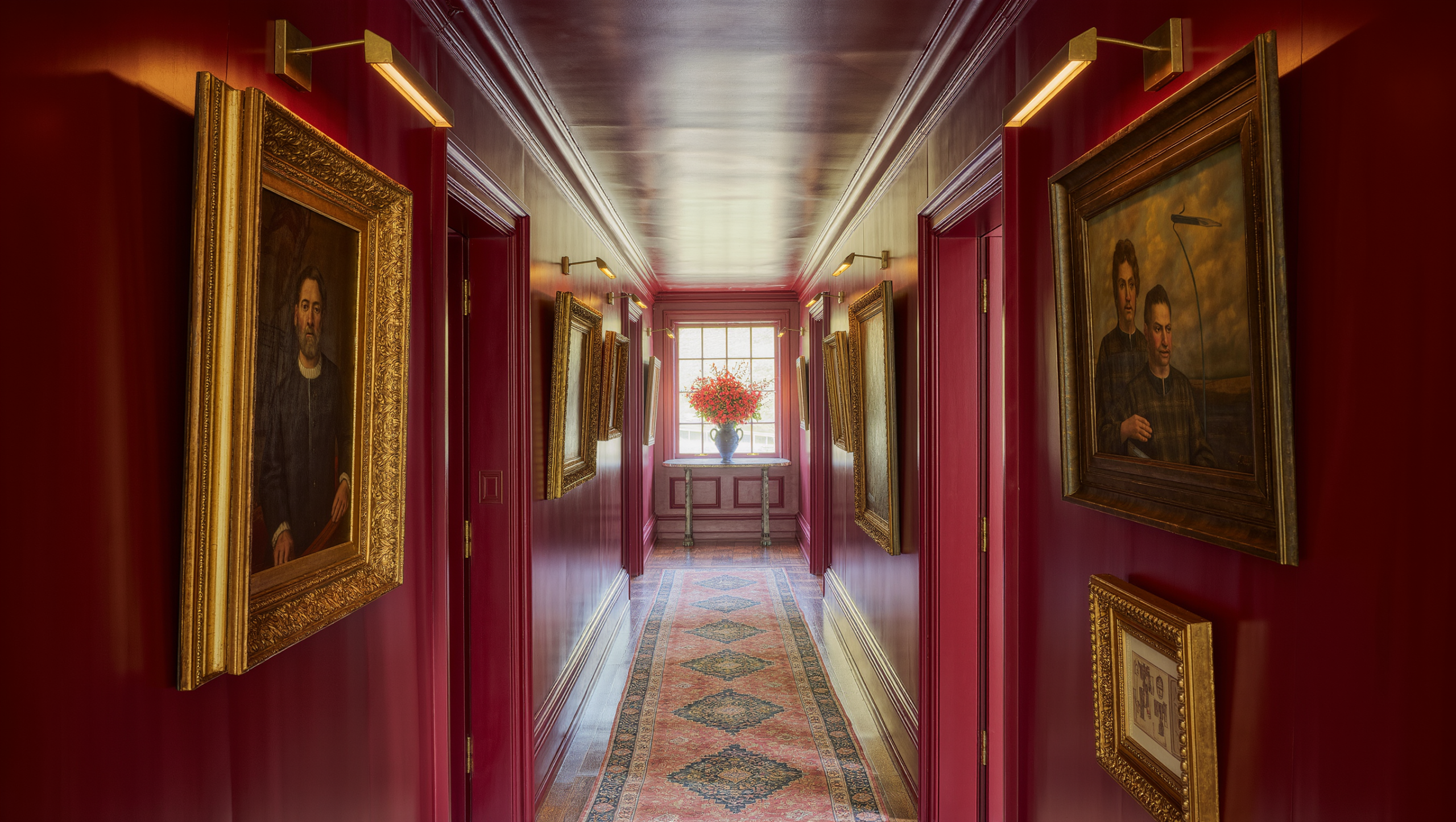
One larger piece can interrupt a long hallway more effectively than a chain of tiny frames. At the far end, a substantial artwork or saturated wall can create a destination so the passage feels like an approach rather than a tunnel. If the hallway is narrow, large art can still work because physical scale and viewing distance are not the same thing. Test with paper taped to the wall before framing.
03 Light and architecture
Illumination and the elements you can’t remove
Light
Reveal, don’t glare
Picture lights, or a ceiling source you can aim. Then go and stand where people actually walk and look at the glass. A hot reflection sitting at eye level ruins a piece more completely than bad hanging ever managed.
Daylight
It moves
Morning is flattering. Four o’clock is not. Any wall that takes direct sun is where the fading happens.
Doors and trim
Part of the composition
Align to the architecture, or cross it on purpose. What reads badly is crossing it by accident.
Switches
Leave them alone
A thermostat is not a blemish. A frame hung to hide a thermostat is considerably worse than the thermostat.
Consider artwork sensitivity to light before exposing valuable, photographic, textile, or fragile pieces to strong sun or continuous illumination. Fixed electrical changes require qualified installation. See Lighting for the broader approach.
Protect the path: frames, picture lights, ledges, and sculptural objects should not project into a narrow route where shoulders, bags, or mobility devices can catch them. Secure heavy frames with hardware appropriate to the wall and load—stability matters more than an invisible hanging detail where children, pets, or high traffic are factors.
04 Finishing
The floor, the endpoint, and family photos
A hallway gallery often becomes stronger when the floor is not also carrying benches, baskets, plant stands, and decorative objects. If seating or storage is genuinely useful, keep it shallow and place it where the route widens—the wall can do the visual work, but the passage still needs to be a passage.
A strong artwork, paint color, mirror, or architectural detail at the endpoint can stop the hallway from feeling endless. If a mirror is used, place it for a useful reflected view rather than simply to “make the space bigger.” The endpoint is where a single dramatic move can save you from overfilling the side walls.
Personal images do not need to be relegated to tiny mismatched frames simply because they are personal. Enlarge the strongest photographs, edit duplicates, and use consistent treatment where it helps the sequence—a family gallery becomes more meaningful when each image is visible enough to be seen rather than included out of obligation.
And rotate. A hallway gets walked through more times a day than almost any room in the house, which makes it one of the few walls where a change actually gets noticed. Swap a few pieces with the season, or when something new arrives, instead of letting the installation creep a little further along the wall every year. Store what comes down properly and photograph the layout if it is complicated — future you will not remember which nail belonged to what.
The failure mode of the gallery wall, incidentally, is not bad taste. It is accumulation. Almost nobody hangs a bad hallway on purpose; they hang a good one and then keep adding to it, one frame at a time, each addition individually defensible, until the thing has no outer edge, no hierarchy, and nowhere for the eye to stop. The discipline is in what does not go up.
The verdict
A walk worth taking, not a wall worth covering
The hallway becomes a gallery when the walk itself has been composed: look, move, pause, turn, discover. The price is mostly restraint. Somewhere there should be a stack of perfectly good pictures left in the closet, because the wall has already said what it had to say.
Get it right and nobody in the house can tell you why the hallway works. They just stop using it as a corridor and start slowing down near the turn.
Same problem, elsewhere in the house
Room notes
Keep the room on the record.
One useful note at a time: what to test, what to ignore, and what changed when the room got another vote.