Light and Atmosphere
India Mahdavi: Color Is More Interesting When It Has a Reason
India Mahdavi is useful to study because color in her work is spatial: it answers a question, occupies meaningful area, works with light and shape, and changes how the room behaves.
The pink dining room India Mahdavi gave The Gallery at Sketch in London — pink from 2014 until she reworked the same room in yellow in 2022 — is the easy entry point into her work, and also the trap. It makes color so visible that the method behind it disappears. Reduce Mahdavi to color and you’re describing a great dinner as “very seasoned” — true, but nowhere near enough.
Color answers a question, or it isn’t done yet
Across interiors, furniture, restaurants, hotels, and residences, Mahdavi treats color as part of the architecture rather than a decorative afterthought. A saturated field can compress or expand perception, clarify a zone, exaggerate an opening, or turn a simple shape into the element organizing the whole room. That reframes the design question. Instead of asking which accent will make a neutral room more interesting, ask what the room needs color to do.
A useful color brief is more precise than bold, joyful, or warm. Does the room need more intimacy? Does an awkward feature need to stop reading as a mistake? Should a passage feel like a transition? If the only answer is “be exciting,” the brief isn’t ready.
Area does what accents can’t
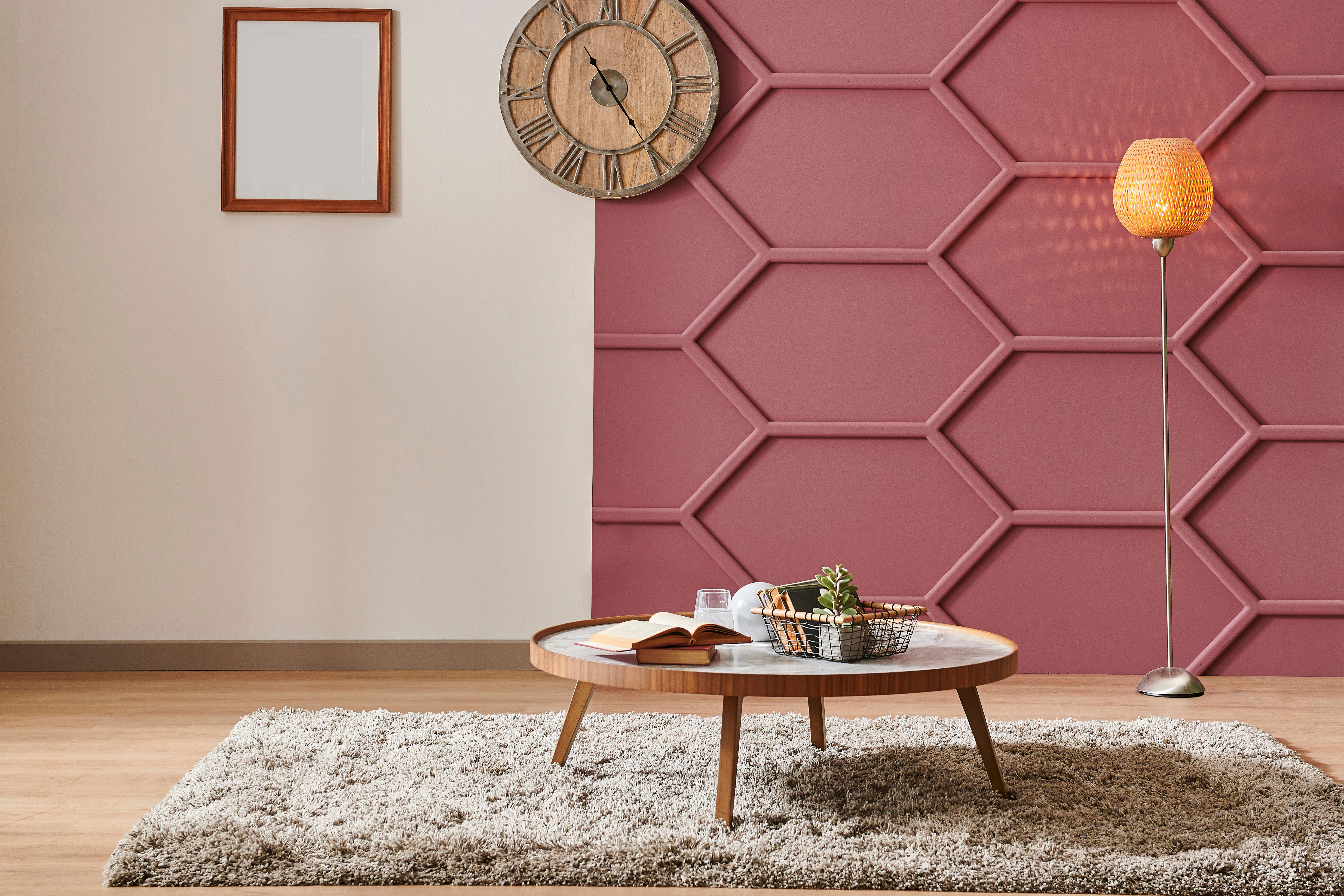
The easiest way to imitate Mahdavi badly is to scatter a few colorful objects around an otherwise neutral room. That may be cheerful, but it doesn’t reproduce the spatial effect of a wall, ceiling, built-in, or continuous surface carrying a committed hue. Large fields can make several surfaces read as one volume, pull a distant wall forward, or turn a niche into a destination for the eye rather than a hole in the wall. If color is meant to change the room, it needs enough area to actually do the job — and concentration usually beats distribution. One committed field can create more impact than several accents trying to stay balanced, which is a useful correction to the decorating habit of repeating every color three times so nobody suspects an accident.
Test the light before you trust the swatch
A paint chip in a store is not the room. Saturated color behaves differently under daylight, warm artificial light, cool artificial light, gloss, matte, and curved versus flat surfaces — and mistakes scale fast with strong color. A hue that looks controlled on a small sample can turn aggressive across several walls, or go unexpectedly dull once evening replaces daylight. Test it where it will live, at the hours the room actually matters.
Material changes the emotional temperature of the same hue: glossy and saturated reads theatrical and sharp, the same color in a soft textile reads enveloping, a colored stone or tile brings pattern flat paint can’t. Choose the material and the color together when a room depends on saturation.
Give the color a shape to live in
A pink curve reads differently from a pink flat wall. A saturated arch, rounded banquette, or blocky piece of furniture gives a hue a form to inhabit, which is one reason Mahdavi’s rooms can feel playful without relying on decorative clutter — geometry and color do the work together, so fewer objects carry more identity. The same logic explains why a sweet, confectionary hue meeting a disciplined line reads as sophisticated rather than childish: friction is often what gives a bright palette its authority.
Pink is not a philosophy
Bubblegum pink plus a curved sofa is not a design philosophy — it’s a costume assembled from the most recognizable evidence, and the weak version is a monochrome room performing confidence it hasn’t earned through proportion, light, material, or use. I would not start by picking the fashionable saturated hue. Name the spatial or emotional problem first, then choose the color, surface, and scale capable of solving it. Color is most interesting when it’s consequential, not when it’s just present.
Source: India Mahdavi’s official project archive, including the Siwa interior; Homes & Gardens’ interview “Layered Lives with India Mahdavi.” The photograph above is Room for Drama’s own illustrative image, not an India Mahdavi project.
Same problem, elsewhere in the house
Room notes
Keep the room on the record.
One useful note at a time: what to test, what to ignore, and what changed when the room got another vote.