Furniture and Scale
Kelly Wearstler: Drama Works Better When the Room Has Discipline
Kelly Wearstler is useful to study because bold rooms work when scale, negative space, material contrast, furniture silhouette, and circulation create discipline underneath the spectacle.

On this page
6
Put one deep emerald wall behind a walnut bookshelf and a single blue velvet chair, and the wall wins before anything else in the room gets a vote. That is the actual Kelly Wearstler lesson — not “buy stranger furniture and add marble,” which is the version that gets copied. Scale decides who is in charge. Decoration only ratifies the decision.
Her studio describes its work as site- and client-specific rather than a repeatable house look, and the early Viceroy hotels are the useful evidence: they landed when upscale interiors still defaulted to polished neutrality, and they argued that a room could carry a strong thesis without becoming illegible. The glamour got the headlines. The thing worth stealing is underneath it, and it is boring enough that nobody ever screenshots it — a hierarchy, decided before anything is bought.
Photograph the room and take the color out of it

Before you decide what your room’s dominant element should be, find out whether it already has one. Stand where you enter, photograph the room, and set the picture to black and white on your phone. Color is a liar in this test; it makes a small bright cushion feel like an event. In grayscale you see mass and value more clearly.
If you would rather not eyeball it, the Squint Test does the same thing arithmetically — drop the photograph in, and it strips the color, blurs the detail away, finds the largest mass in the frame and tells you how far ahead of second place it is. It runs in your browser and the picture is never uploaded.
One of two things comes back. Either a single dark or large shape holds the frame and everything else arranges itself around it — that is a room with a hierarchy, and your job is to protect it. Or you get an even gray field with several mid-tone objects of roughly equal visual weight. Everything is auditioning. Nobody gets the role. And no amount of new furniture fixes it, because the problem is not what is in the room, it is that the room has never been asked to rank anything.
One thing gets to be twice as loud as anything else
Wearstler’s rooms let one object, one light, one artwork, or one field of material be larger than polite decorating would suggest. Polite decorating spreads risk evenly. That is why it is safe and why it is dull.
The workable version at home: your dominant element should read at roughly twice the visual weight of the next thing down. That is deliberately a visual heuristic, not a measurement — you are checking that the gap is obvious in the grayscale photo. A painted wall qualifies, and it is the cheapest way in, because a wall is already the largest surface you own. So does one oversized piece of art, one heavy hearth, one long low cabinet in a strong wood.
What does not qualify: a gallery wall of nine small frames that averages itself into wallpaper; a pair of matched objects splitting authority; four bold cushions. If you hang art over a sofa or console, two-thirds to three-quarters of the furniture width, a 57-to-60-inch center height, and roughly 6 to 8 inches above a sofa back are all familiar decorating starting points. They are not codes, universal ergonomic rules or requirements. Art scale, ceiling height, seated sightlines, furniture dimensions and the actual room can justify something very different.
Silhouette moves a room before color does
Curves, blocky masses, odd legs, low profiles, strong negative shapes: these change a room before anyone has finished inventorying the palette, which is precisely why copying the color alone reproduces none of the effect. A quiet neutral room with one committed silhouette is closer to the method than a room full of marble and brass sitting on ordinary shapes.
This is the free move in the whole essay, and it is why you should do the grayscale test before you shop. Silhouette is mostly a question of what you already own and where it sits. Pull one chair off the wall and turn it fifteen degrees. Move the low blocky thing to the wall where it can be seen against nothing. You are not adding shape, you are uncovering it.
Two materials can argue. Five is noise.
Gloss beside rough stone, figured marble beside plain plaster, vintage wood beside polished metal — the friction is what stops expensive finishes flattening into generic luxury. A polished surface is sharper next to something matte. A veined stone is more legible next to a quieter field. Match every finish and you can get a room that is technically coherent and emotionally forgettable.
The discipline is the count. One loud adjacency per sightline is a useful editing rule for this method, not a law. When you stand in the doorway and look at the far wall, you should be able to name the material argument in one sentence. If naming it takes three clauses, you may have several competing events happening in one view. Pick the one you like, and let the others go quiet.
History enters the same way. Hollywood Regency, modernism, the 1970s, the local architectural memory of the building itself — these show up in her work without locking a room into a period. A reference contributes a shape, a proportion or an attitude and stays visibly reinterpreted. Take the part that improves the room, not the whole costume.
The empty floor is not wasted floor
A dramatic chair needs floor around it. A monumental stone feature needs something plain nearby to look monumental. This is the lesson imitators skip, because subtraction cannot be photographed for a shopping list.
Use circulation numbers as mock-up ranges, not verdicts: something like 30 to 36 inches for a primary household route, around 24 inches for some low-frequency secondary passages, and 14 to 18 inches between a seat and coffee table can be useful places to begin testing. They are ordinary residential decorating heuristics, not code dimensions and not proof of accessibility. If an accessible route or mobility accommodation matters, use the actual user, equipment and applicable standard; the U.S. Access Board publishes formal accessibility dimensions for covered conditions.
Crowd a statement piece to within an inch of a walking route and it stops making a statement and starts collecting bruised shins. Before you add another object to a bold room, look for the piece already in it that deserves more air. Old against new, curved against severe — that friction only reads as energy when the plan underneath it holds still.
Marble and brass are the merchandise, not the method
A recognizable designer vocabulary turns into merchandise fast. Marble, brass, sculptural seating and a vintage reference, assembled into something that photographs bold while the room underneath stays generic. I would not start from that shopping list, and I would not chase the budgets, custom fabrication or architectural opportunities of a major studio. Copying the objects without the scale and context is where inspiration becomes expensive cosplay.
So do the cheap part first. Take the grayscale photograph. Name the one element that deserves to dominate. Remove one competing statement — not add, remove — and look again. If the room now has a clear first thing, you have earned the right to shop. If it still reads as an even gray field, the problem was never the budget.
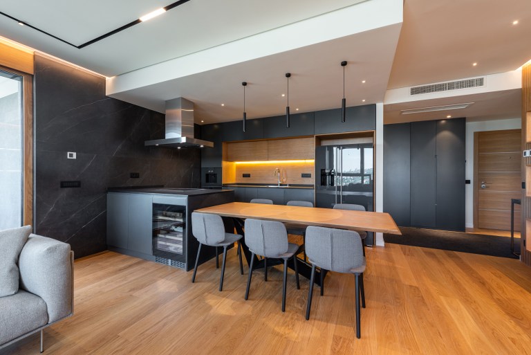
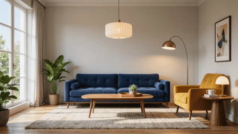
Source: Kelly Wearstler’s studio biography and project archive; Architectural Digest’s AD100 Hall of Fame profile and its feature on the growth of her studio. The photograph above is Room for Drama’s own illustrative image, not a Kelly Wearstler project.
Correction — September 7, 2026: An earlier version presented common art-hanging, circulation and coffee-table distances as “ordinary circulation figures” without clearly distinguishing decorating convention from code or accessibility standards. Those ranges are now explicitly labeled as heuristics, with formal accessibility guidance linked separately.
Same problem, elsewhere in the house
Room notes
Keep the room on the record.
One useful note at a time: what to test, what to ignore, and what changed when the room got another vote.