Furniture and Scale
Jake Arnold: Atmosphere Is Built From More Than Brown Paint
Jake Arnold is useful to study because atmosphere in his work comes from material depth, furniture scale, shadow, localized light, age, and comfort—not simply a brown palette.
Jake Arnold’s rooms helped make moody, layered, old-world-adjacent interiors enormously popular. They’ve also inspired plenty of rooms that borrowed the brown paint and forgot everything else. The useful part of Arnold’s work was never the palette — it’s material, proportion, age, furniture scale, and light, assembled so the room doesn’t bounce everything back at you with retail efficiency. Mood is a spatial condition, not a shopping category.
He co-founded a company to sell the part everyone skips
Arnold co-founded The Expert in 2020, a platform that sells hour-long video consultations with designers. Set that against the problem this piece is about and it turns interesting. The failure mode of the imitation is that the output is free to look at and the reasoning is not — anyone can see the brown wall, nobody can see why it is that brown, in that room, at that sheen. The Expert is a business built precisely on that gap. Someone worked out that the scarce thing in this industry was never the photograph.
You can also go and read his reasoning, which is not true of every studio in this series. Architectural Digest published the Beverly Hills house he did for John Legend and Chrissy Teigen in August 2023, and “Redefining Comfort,” out the following month, takes nine of his projects apart. If you are going to borrow from somebody, borrow from somebody who has put the reasoning somewhere you can read it. A room you cannot explain is a room you will be redoing in three years.
Age is what interrupts the flatness
A worn timber surface catches light differently from a perfectly uniform laminate; plaster reveals variation; natural stone refuses to repeat itself exactly. Those details interrupt the flatness that can make a newly finished room feel commercially fresh — not fake history, just material depth. The shallow imitation is easy: buy an old-looking pot, add a distressed stool, declare the room soulful. The stronger move is to find which large surface or major object feels too smooth, thin, or new, and change the material condition specifically there.
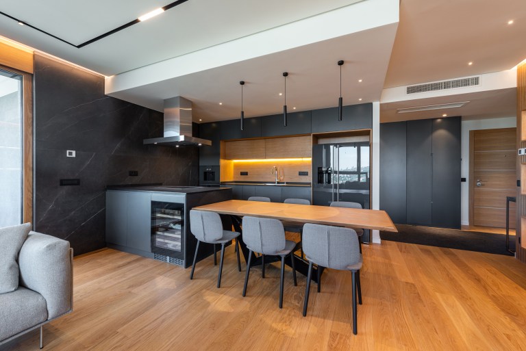
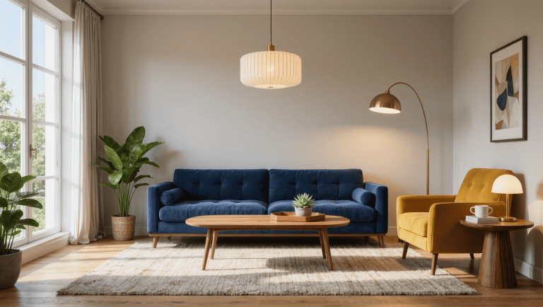
Furniture scale does related work. Substantial sofas, deeper seats, and grounded silhouettes create a human-sized territory inside larger architecture — useful in new houses with generous ceilings, where the body can feel oddly small even when the furniture technically fits. That doesn’t mean everything should be oversized; it means the largest pieces need enough visual mass that small accessories aren’t being asked to organize the whole volume on their own.
Light is doing more work than the paint color
Dark neutrals get the attention, but atmosphere depends just as heavily on illumination. Warm, localized pools of light create territories; shade around corners adds depth; a lamp near a chair makes the room feel inhabited because the light belongs to an activity. One bright ceiling fixture flattens all of that — it can make every object visible while making the room itself feel less dimensional. Before repainting a pale room brown in pursuit of mood, turn off the overhead light and test lower sources at different heights first. The cheapest atmospheric correction is often a better lighting hierarchy, not a new wall color.
Surface variety carries the rest. Textured plaster, linen, wool, and leather absorb and reflect light differently, which creates depth even inside a restrained palette — a room full of beige can still feel flat if every surface is equally smooth and evenly lit. If a muted room feels sleepy, the missing ingredient is usually material contrast, not another shade of taupe. And some shadow is allowed to exist: task areas and routes still need real visibility, but a room that’s over-lit everywhere loses the depth that difference creates.

The palette is the least interesting part
Brown walls, plaster, a vintage stool, and an oversized branch arrangement have become a recognizable shorthand, and shorthand is exactly the problem — when the atmosphere can be recreated as a shopping list, the room is borrowing the least interesting part of the work. I would not start with palette. I’d start by diagnosing where the room feels hard, bright, thin, or newly manufactured, then use material, light, and furniture mass to correct that condition. Atmosphere is the result of several systems agreeing, not one paint chip doing unpaid overtime — and comfort still has to survive contact with an actual evening. The photograph is the easy shift.
Source: Jake Arnold’s studio site, compared across multiple projects; his book “Redefining Comfort” (Rizzoli, September 2023), which documents nine of them; Architectural Digest’s AD100 profile and its August 2023 feature on the Beverly Hills house he designed for John Legend and Chrissy Teigen; The Expert, the consultation platform he co-founded in 2020.
Designer study. This concise study is part of Designers Worth Studying, the deeper Room for Drama index for what to borrow, what not to copy, and how each idea survives an actual room. Photographs in this series are Room for Drama’s own illustrative images, not photographs of the designer’s projects.
Same problem, elsewhere in the house
Room notes
Keep the room on the record.
One useful note at a time: what to test, what to ignore, and what changed when the room got another vote.