Light and Atmosphere
Pattern Sandwiching Without the Visual Hangover
Layer wallpaper, painted trim, ceilings, wainscoting, and patterned textiles with a clear hierarchy so one hero pattern leads and at least one surface stays quiet instead of the room feeling visually overbooked.
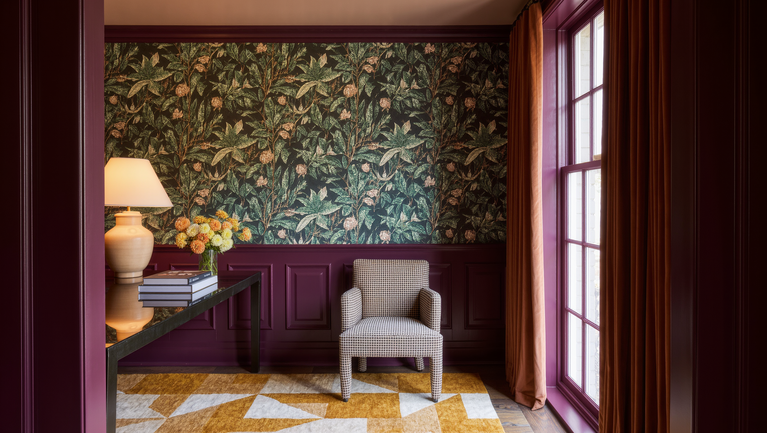
Pattern sandwiching sounds like a trend. The useful part is older: one pattern gets framed by color, material, or architectural detail so the room feels layered instead of wallpapered by accident.
The current version often combines wallpaper with painted trim, wainscoting, a colored ceiling, tile, or another patterned surface. Done well, it creates depth and personality. Done badly, every plane asks to be the main character.
Choose the hero pattern first
Start with the surface carrying the most information. Usually that is wallpaper, tile, or a large textile. Its palette, repeat, contrast, and scale should set the rules for what follows.
Do not choose the trim color, ceiling treatment, and secondary pattern independently. Pull them from the hero pattern or deliberately oppose it for a reason you can explain.
Decide what frames what
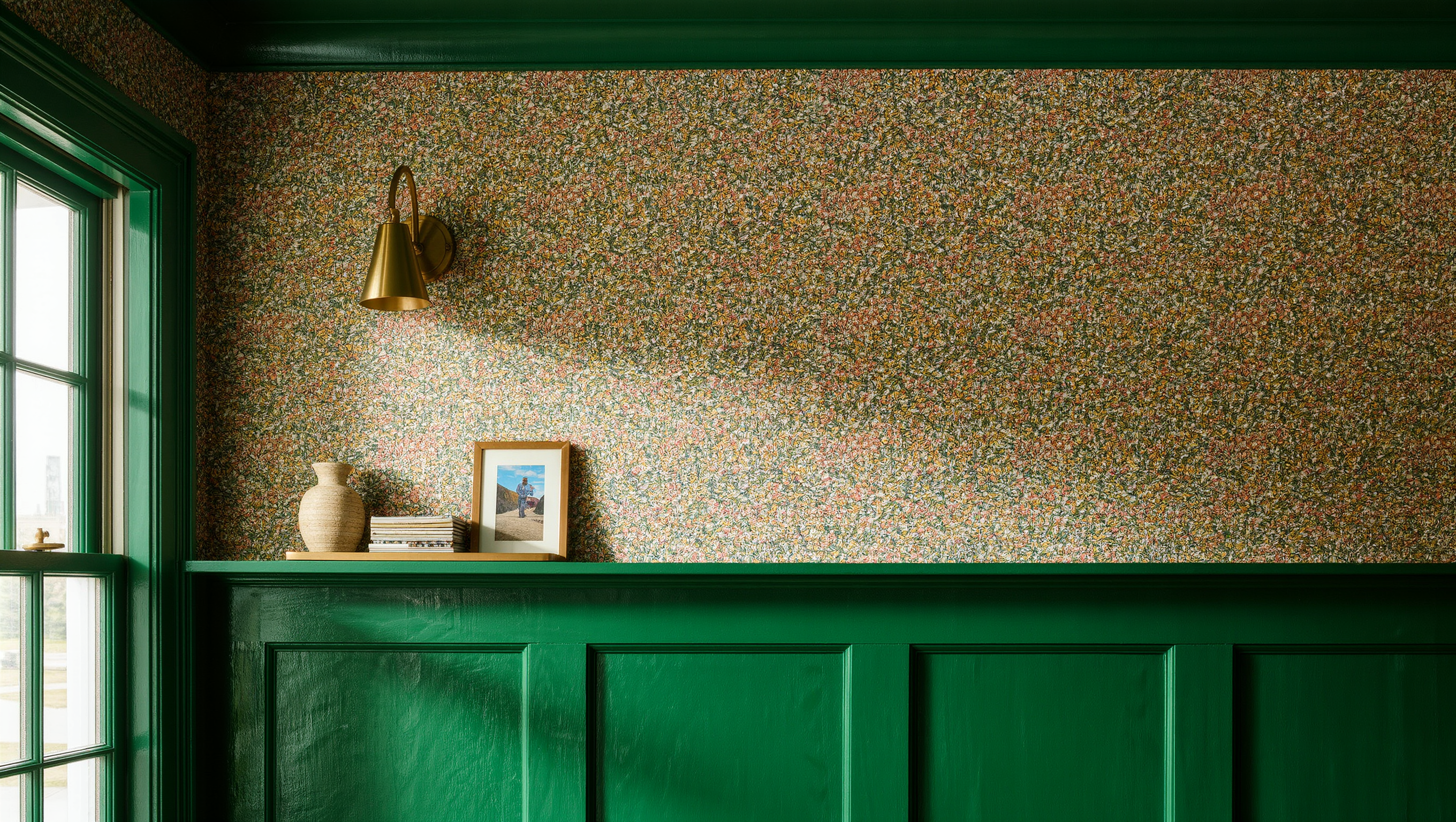
Pattern sandwiching works because one layer contains another. Painted millwork can frame wallpaper. A solid ceiling can cap patterned walls. Wainscoting can give a busy upper wall a calm base.
If every surface has equal contrast, there is no frame—only competition. Decide which plane should lead when someone enters the room.
Control scale before color
Two patterns can share colors and still fight if their repeats are too similar. Pair a larger motif with a smaller texture or stripe. Give the eye a change in rhythm.
In small rooms, a large repeat is not automatically wrong. Large pattern can make a small room feel decisive. The more important question is how much wall the repeat gets and whether furniture interrupts it constantly.
Use solid color as breathing room
Solid paint, quiet flooring, simple cabinetry, or unpatterned upholstery can keep a layered room from becoming visually exhausting. Rest does not have to mean white. It can be deep green, plum, tobacco, cream, blue, or another controlled field.
A room with pattern on the walls and ceiling may need restrained furniture. A room with plain architecture can carry stronger textiles.
Millwork is a proportion decision disguised as a color decision
Colored trim convinces when it outlines something worth outlining — a doorway, a window, a panel, a niche, a change of plane. Paint every edge in the room a contrasting color and the architecture stops reading as architecture and starts reading as a diagram of itself. Follow the trim line around corners and into the adjoining rooms before committing, because that is usually where the scheme falls apart: trim that looks decisive in one room can look like an unfinished thought in the hallway it runs into.
Wainscoting is the same decision with higher stakes, because its height changes the apparent proportion of the wall. Do not reach for the default fraction. Look at where the furniture backs sit, where the windowsills land, where the switches and radiator tops are, and what the existing trim is already doing — then tape the line on the wall and live with it for a few days. A rail that runs two inches under the sofa back, or clips the bottom of a sill, will bother you for years and you will never quite be able to say why.
Treat the ceiling as part of the composition
A colored or patterned ceiling can make a room feel more complete, but it should connect to something below. Pulling a quieter tone from wallpaper can create enclosure without turning the ceiling into a separate event.
A room already carrying an expressive ceiling rarely needs another layer underneath it. A ceiling is a design surface, not a bonus round, and the question is what it is doing in relation to the walls — not whether it has been given something to do.
Check pattern in real light
Wallpaper and paint can shift significantly between daylight and lamplight. Gloss, metallic inks, deep colors, and high-contrast prints may become more pronounced after dark.
Order or create the largest practical samples and view them on more than one wall. A pattern beside a window may behave differently from the same pattern in a shadowed corner.
Respect doors, switches, and awkward interruptions
Pattern does not stop being pattern because a thermostat appears. Map vents, switches, outlets, doors, sconces, and wall-mounted equipment before deciding where the strongest motif should land.
Large repeats can look accidental when key elements are cut through awkwardly. A good installer can help plan placement; complicated wallpaper or finish work may be worth professional execution.
Let adjoining rooms answer rather than repeat
A heavily layered room benefits from a quieter threshold. The next space can repeat one color, material, or motif without copying the entire pattern system.
Think of the house as a sequence. Drama has more impact when every room is not using the same volume.
The doorway test, then the sofa test
Stand outside the room and look in. What do you read first? If the ceiling, the wallpaper, the trim, the rug, the upholstery and the art all arrive simultaneously, the room has no hierarchy and one layer has to go quiet. Not removed, necessarily — dropped in contrast, pulled closer to a neighboring tone, given less wall. Something has to agree to be second.
Then go in and sit down, because the doorway view is the one you get for four seconds and the seated view is the one you get for four hours. Plenty of schemes photograph beautifully from the threshold and are exhausting from the chair. The chair wins that argument every time.
The whole method, compressed
One hero pattern. One dominant solid pulled out of it. One architectural frame — trim, paneling or ceiling, whichever the room already has an argument about. A secondary small-scale pattern only if the room asks for one, and most rooms do not ask. Then protect one large area of visual rest, which is the step everyone skips and the reason layered rooms turn exhausting by year two. Finally, carry one element — a color, a material, a motif — into the next room, so the house reads as a sequence instead of a series of unrelated decisions made on separate weekends.
See The Reference Room and Atmosphere for more work on palette, texture, and visual hierarchy.
All of which is one instruction wearing several outfits: decide what leads. A room with five surfaces shouting is not maximalist. It is undecided, at volume.
Same problem, elsewhere in the house
Room notes
Keep the room on the record.
One useful note at a time: what to test, what to ignore, and what changed when the room got another vote.