Small Interiors
Small Rooms Need One Strong Idea, Not Five Small Ones
Give a small room one decisive design move—color, scale, art, lighting, material, or layout—then edit secondary choices so the space feels confident rather than busy.
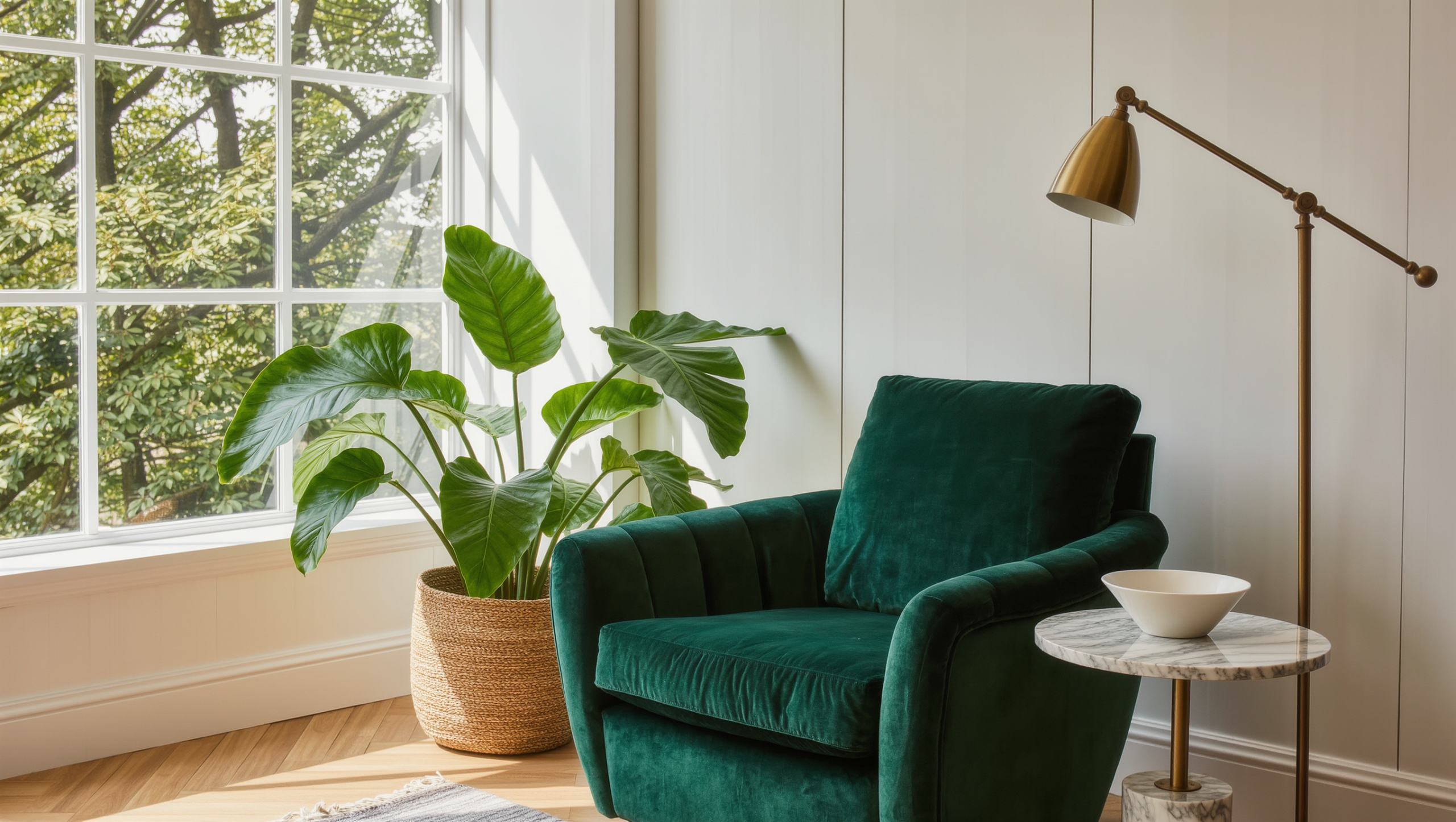
Small rooms have less room for committee decisions.
A little wallpaper, several tiny artworks, two accent colors, a patterned rug, a decorative shelf—none of these is wrong on its own. But stack five modest ideas into one small footprint and the room gets busier without getting more designed. It is a familiar kind of misery: someone can love every individual choice and still not understand why they dislike the room. Usually it is because nothing was ever allowed to lead. Everyone got a vote and the room ended up looking like it was decorated by committee, which, unfortunately, it was.
Small does not mean timid. It means editing. Give one idea enough scale to run the show, and the rest of the room can relax into supporting roles instead of elbowing each other for attention.
Start with the room’s actual job, not its Pinterest board
Before you pick the big move, figure out what the room needs to do most often. A small dining room, bedroom, office, and lounge do not need the same kind of authority. If storage is the real problem, the big move might be one full-height storage wall. If the room lacks social focus, it might be a generous seating group and a rug big enough to actually anchor it. If the room just feels flat, color or lighting can carry more weight than another piece of furniture ever will, and a third throw pillow has never once fixed a lighting problem. (If the room is trying to solve several unrelated problems at once, that’s a Room Function conversation, not a decorating one.)
Once you know the job, choose the idea with the biggest payoff—one saturated color, an oversized artwork, a rug that’s actually generous, a dramatic pendant, a wall of books, a confident furniture arrangement. The move should change how the whole room reads, not add one more decorative inch. The best big move usually does both at once: it fixes something functional and it looks like a decision, not an accident you’re standing next to.
Let scale do the calming, then edit the rest
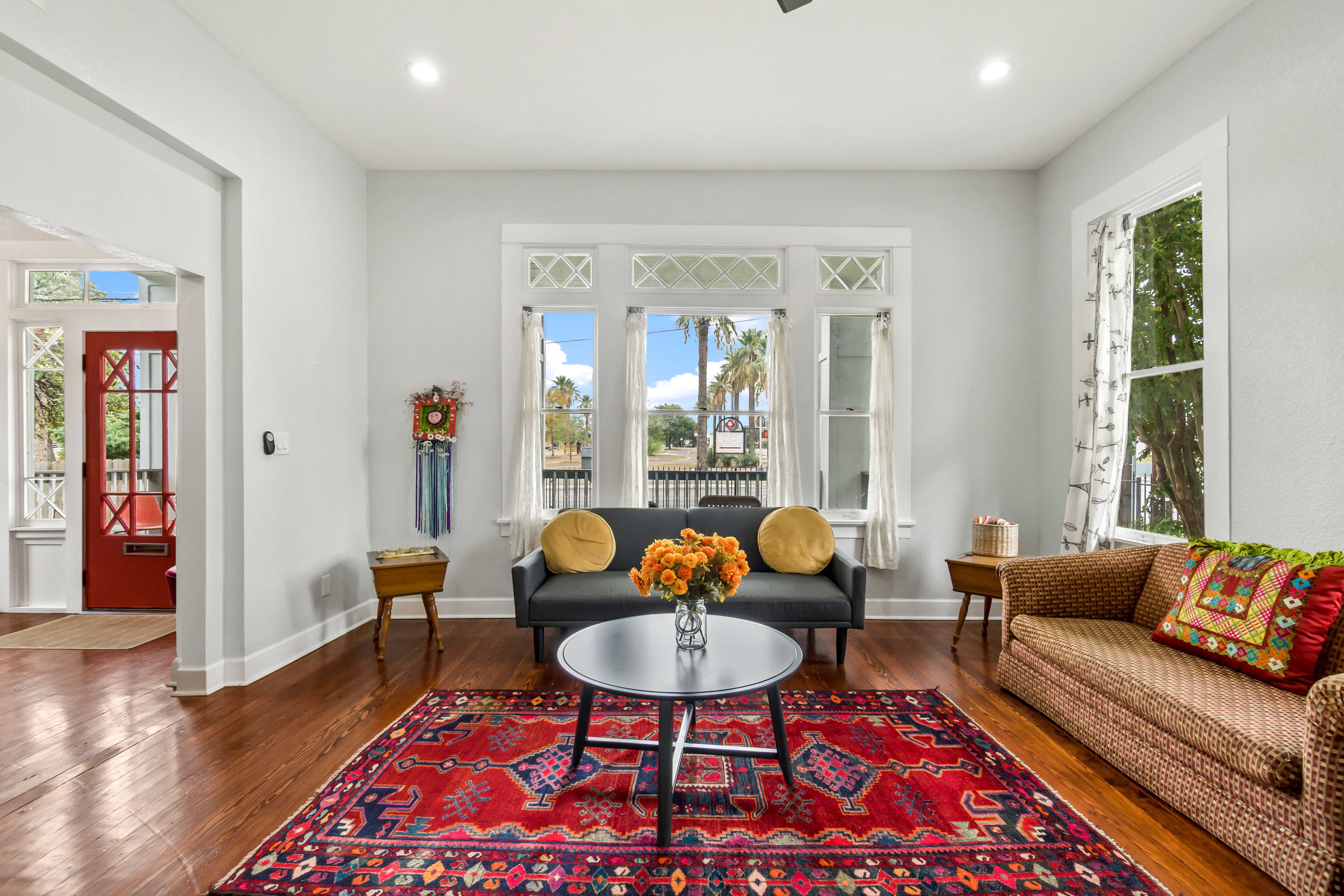
Fewer, larger elements reduce visual fragmentation. That doesn’t mean stuffing in oversized furniture—it means choosing pieces with enough presence to organize the space. A large rug can connect several chairs into one idea. One artwork can resolve an entire wall. Full-height curtains create vertical scale you will never get from a shelf of trinkets, no matter how charming each individual trinket is.
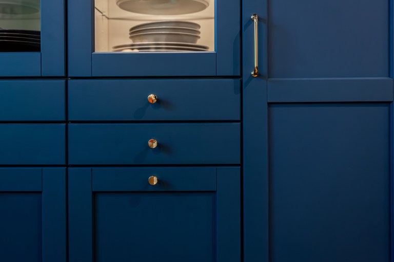
Once you’ve picked the lead, interrogate everything else: does this pattern, object, or color strengthen the direction, or is it starting its own conversation in the corner? Supporting doesn’t mean matching. A bold blue wall is often stronger next to warm wood and one red artwork than surrounded by six coordinating blue accessories that all showed up wearing the same outfit and now nobody can tell who’s actually in charge.
And leave something alone. One quiet wall section, one open corner, one clear stretch of floor. Filling every edge actually makes a room feel smaller, because there’s no visual rest between decisions. If pulling one small piece out makes the big idea look better, that piece was competing, not contributing—and it can go live somewhere else, no hard feelings.
Keep it livable while you’re at it: a strong visual idea doesn’t excuse an uncomfortable chair, a blocked door, or a table nobody can actually use. Tape the furniture footprint. Open every drawer and door before you buy. In a small room, an inch of decorative enthusiasm becomes a daily circulation problem fast, and nobody wants to do a hip-check with the console table every morning.
Storage, light, and material are one story, not three separate errands
Storage should play a quieter role—closed fronts for mixed categories, a cabinet that visually disappears instead of six open baskets doing their earnest best. Light should support the main idea: if the big move is a wall of books, light that wall, and use a few sources at different heights instead of one flat overhead doing all the work alone. Material should repeat rather than multiply: one wood tone, one metal, one textile family, so the room isn’t running three unrelated material conversations in four hundred square feet. And don’t forget the ceiling. It’s the most underused surface in a small room. Paint, a pendant, vertical shelving all draw the eye up without adding another object to the floor for someone to trip over.
For the practical systems behind each of these, see Small Interiors: The Footprint Audit and Lighting.
Protect the room from trend stacking
A small room does not need every current idea at once. Pick the concept that actually fits the architecture and the household, then let trends in only where they genuinely support it. Five popular ideas rarely add up to one original room—more often they become five recognizable ideas fighting for the same square footage and the same camera angle.
Sometimes the room has already volunteered its answer—a fireplace, an odd window, a low ceiling, a deep alcove, a view, an inherited piece with real character. Before you add a dramatic gesture, ask whether the architecture already gave you one. Sometimes the strongest move is to stop covering up the thing that made the room interesting in the first place. The odd alcove was never the problem. The three things parked in front of it were.
The small room doesn’t need less personality. It needs more editorial control. Name the five strongest visual ideas competing in the room right now. Keep the one you’d still want if the other four vanished tomorrow. Quiet one competitor for a week and see if the room gets clearer. If it does, keep editing before you add anything new—the room will thank you, quietly, by finally looking finished.
Same problem, elsewhere in the house
Room notes
Keep the room on the record.
One useful note at a time: what to test, what to ignore, and what changed when the room got another vote.