Light and Atmosphere
The Room That Knows When to Lower Its Voice
A softly mischievous full-build guide to creating a peach, chamomile, oat, and celery-green room that feels calm, useful, grown-up, and beautifully looked after.
On this page
12
Some rooms believe calm means beige furniture standing very still. Others confuse softness with an avalanche of scallops, bows, and cushions no human spine has ever requested.
This room takes its temperament from a short list of conditions: white peach, chamomile, celery green, warm daylight, and the quiet luxury of being looked after without being fussed over.
The translation is not a nursery or spa waiting room. It is a real space for reading, working, talking, recovering, eating, and occasionally doing nothing with considerable skill.
Softness Needs Structure
Pale color alone does not make a room calm. Without hierarchy, useful storage, clear routes, and enough contrast, softness becomes visual fog.
Decide what the room is mainly for before deciding what color it is. Then give that activity the best daylight available, a position a body can hold for an hour, a surface within reach, and a clear way in and out. The palette reinforces that arrangement. It cannot stand in for it, though a great many pale rooms are quietly hoping it will.
Teach the Room When to Lower Its Voice
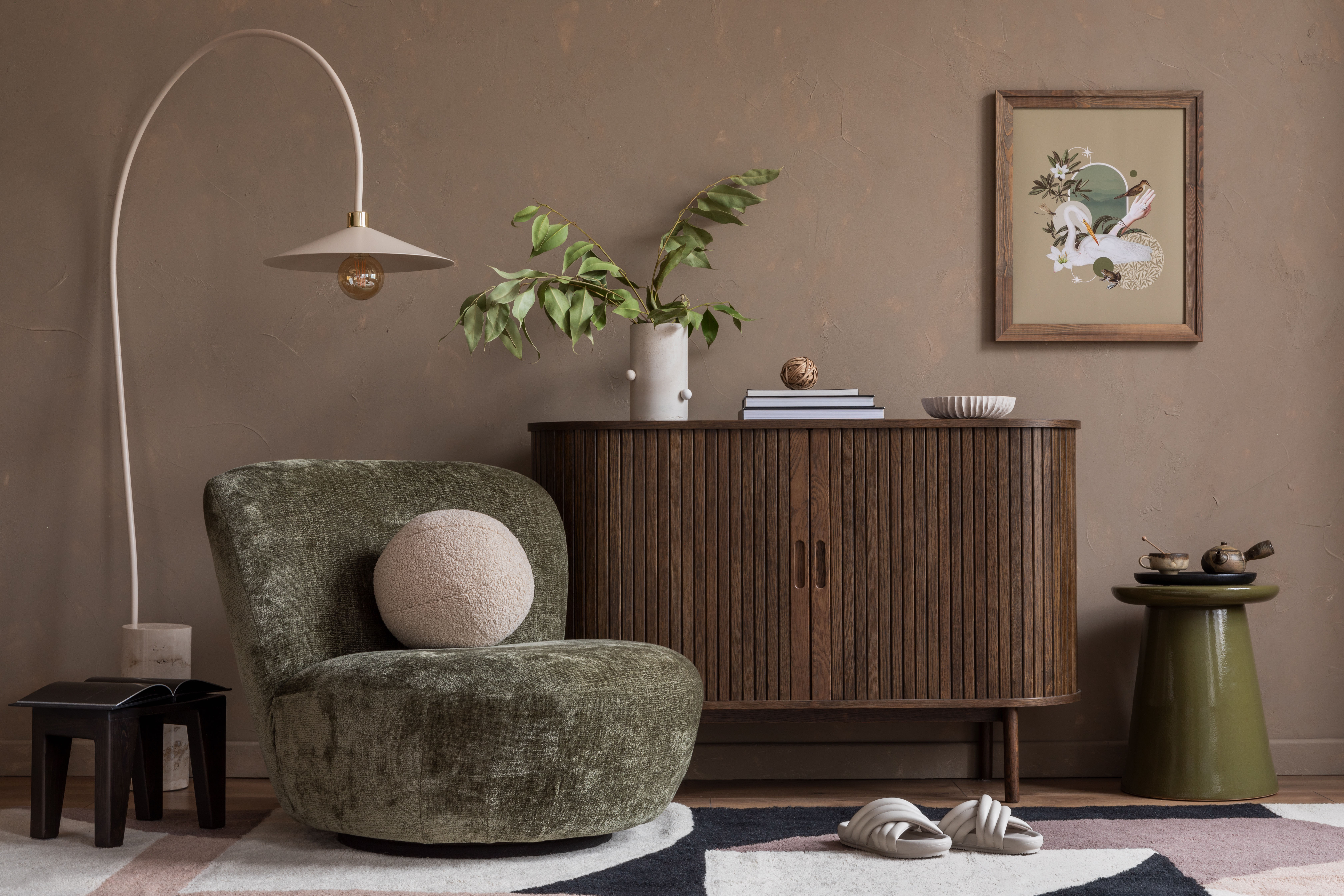
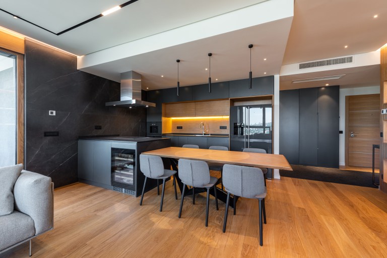
Use one sharper line to hold the soft room together.
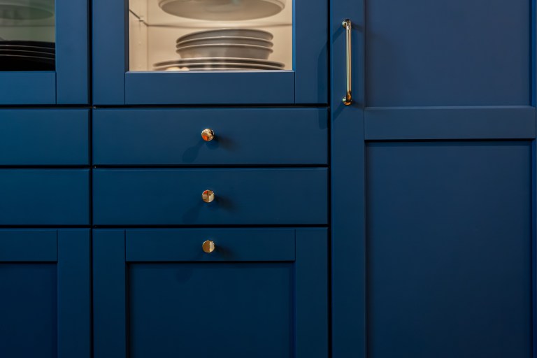
A deep green cabinet. A dark timber table, a black window frame, a strong piece of art, a tailored stripe, a clean architectural edge. Any one of them will do. The line only has to give the pale colors something to push against.
Leave the counterweight out and the room reads sweet and unfinished, like a sentence nobody bothered to end. Put four of them in and the gentleness that made the whole idea worth having is gone.
Give Each Pale Color a Job
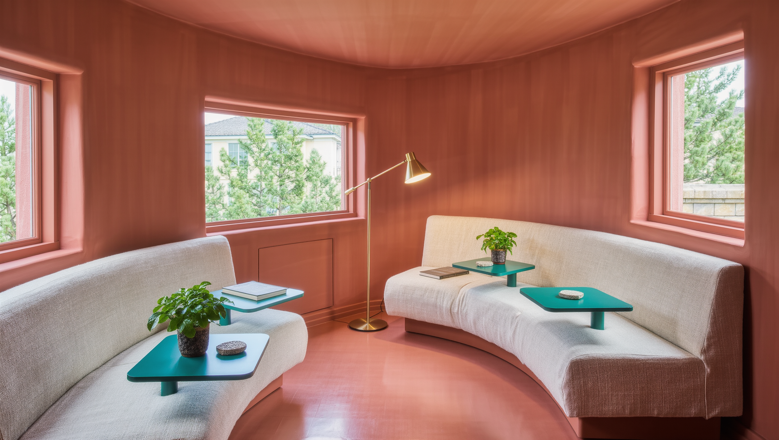
Warm white, oat, or pale plaster take the largest surfaces, where the real job is returning light rather than being noticed. Peach and apricot go into the things people touch: upholstery, curtains, art, or one defined wall plane. Celery, sage, and leaf green are how the room admits that a garden exists, through planting, cabinetry, tile, or a single substantial chair.
A sharper yellow-green or citron belongs only where the eye needs waking. A lamp, the inside of a bookcase, a piece of art, one small table. Concentrate it. Scattering the accent across minor objects makes the room look indecisive rather than alive.
The Life This Space Needs to Support
A reading room needs directional light, a chair that supports a spine, and somewhere to put a book down without losing the page. A guest room doubling as an office needs storage that makes the work disappear at the end of the day. A living room needs seats that face each other, low evening light, and surfaces that stay usable. A recovery room needs acoustic softness and control over glare and interruption, roughly in that order.
Do not design a vague “calm room.” Design a specific life that happens to feel calm because the space supports it well.
Materials Should Feel Gentle, Not Fragile
Washed linen and cotton bring softness and movement. They also wrinkle, fade, and stain in direct proportion to how much the room gets used, which is either the charm or the problem depending on the household.
Wool and bouclé quiet a room acoustically while giving the hand something to find. Settle the loops, the cleaning, and how wear will look on them before anything gets ordered.
Light timber, cane, and woven fibers add warmth and grain, and they are most of the reason a pale room does not read as clinical. The trade is dust, a response to moisture, and structural durability that varies more than the showroom suggests.
Matte ceramic, plaster, and pale stone create calm by refusing to reflect anything back. Porosity is the catch. Find out what a given surface absorbs, and what keeping it will cost in effort, before it goes anywhere near daily use.
Choose materials that can age visibly without making the room feel neglected.
Keep the Floor Plan Quiet
Calm gets much easier when the route through the room stops cutting across the thing the room is for. Protect a direct path first. Then arrange the main furniture alongside it rather than inside it.
Resist filling every edge with small tables, baskets, and occasional chairs. Several slight objects generate more visual movement than one substantial piece doing an actual job, and movement is the thing you were trying to get rid of.
Leave one corner or wall unassigned so the room has room to recover from daily life.
How the Space Changes Through the Day
In daylight, filter the glare rather than dimming the whole room, which is the usual overcorrection. Put the tasks where the diffuse light actually lands. And leave the window able to open, because a window decorated shut has stopped being a window.
At dusk, turn the lower shaded sources on before the room needs them rather than after. Pale textiles and green surfaces go flat without directional warmth. They stop reading as surfaces and start reading as shapes.
After dark, keep the main activity and the route lit, and let the rest of the room go. A calm room should not become evenly bright and emotionally absent.
Storage Should Make Quiet Possible
Open shelves can carry a few books, some ceramics, the objects that mean something. Daily equipment, paperwork, chargers, spare bedding, and supplies need a door in front of them, placed near the activity they serve rather than wherever the closet happened to already be.
Do not hide every sign of life. Contain the categories that create visual static and leave the objects with enough scale or meaning to hold open space well.
The Surface You Do Not Fill
One pale empty surface, open corner, or unfilled stretch of floor can be more calming than another soft accessory. Negative space gives the colors and textures their shape.
Resist the urge to complete the room through accumulation. Softness depends on intervals.
The Clever Move
Build one corner out of what the house already contains. A comfortable chair or a work surface, daylight you can control, one low lamp for the evening, a pale textile, something soft and green, and one sharper line in dark or citron. Nothing new has to be bought to find out whether the idea holds.
Use it for a week. If the corner is chosen naturally and resets easily, extend the approach. If it photographs beautifully but remains empty, correct the activity, posture, or route before buying more softness.
What You Can Afford to Get Wrong
Most of what this room asks for is reversible at the cost of an afternoon. Textiles come off. Lamps move. A bookcase interior painted the wrong citron can be repainted before dinner, and nobody will ever know it was there.
Two decisions are not like that. The structural dark line is the first, because the version that actually works is usually cabinetry, a window frame or a floor, and those get bought once. Closed storage is the second, because containment sized for the wrong categories never gets corrected — it gets tolerated, and within a month the paperwork is back on the chair. Spend the thinking there and let the peach take its chances.
What to Leave Alone
Do not paint useful timber. Do not strip out strong architecture or cover good flooring because it failed to be pale enough. The material already in the room is usually the exact structure the soft palette has been looking for.
The finished room should feel cared for, not fussed over. It lowers its voice because movement, light, storage, and material have stopped shouting—not because every surface has been asked to whisper in peach.
Same problem, elsewhere in the house
Room notes
Keep the room on the record.
One useful note at a time: what to test, what to ignore, and what changed when the room got another vote.