Function and Flow
The Built-In Wall Is Replacing the Furniture Pile
One built-in wall can absorb storage, display, seating, media, and everyday mess without turning a small room into a furniture holding pen.
There is a special kind of small-room breakdown that ends with six unrelated pieces of furniture pressed against four walls, each one solving exactly one problem and together creating a new problem called why does this room look like it is waiting for a yard sale?
A media console. A skinny cabinet. A storage bench. A bookcase. A bar cart. Something narrow and desperate in the last twelve inches because apparently we are decorating by emergency response now.
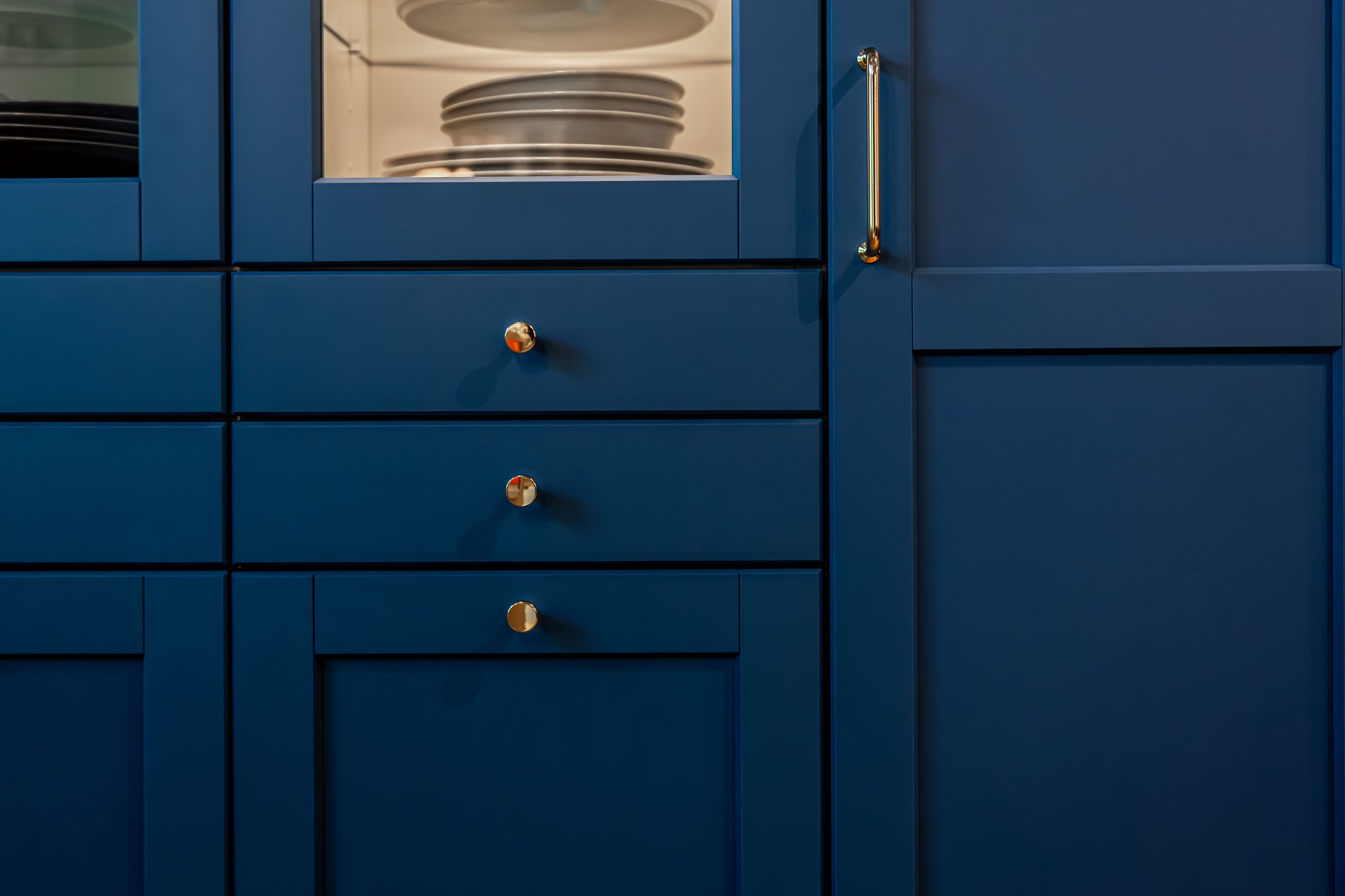
The zoned built-in wall makes sense to me because it does the opposite. Houzz has called zoned built-ins a defining 2026 direction, and its kitchen research found specialty built-ins in more than three-quarters of surveyed renovations. I do not care about the trend because cabinetry suddenly became exciting. Built-ins have been around forever. I care because people appear to be rediscovering a very useful idea: one strong architectural move can calm the operating system of a room without making the room itself boring.
Give one wall the jobs nobody came to admire
Cords. Chargers. Games. Paperwork. Dog gear. Serving pieces. The printer that is somehow ugly from every angle. These things are allowed to exist; I just do not need all of them auditioning for visual attention at the same time.
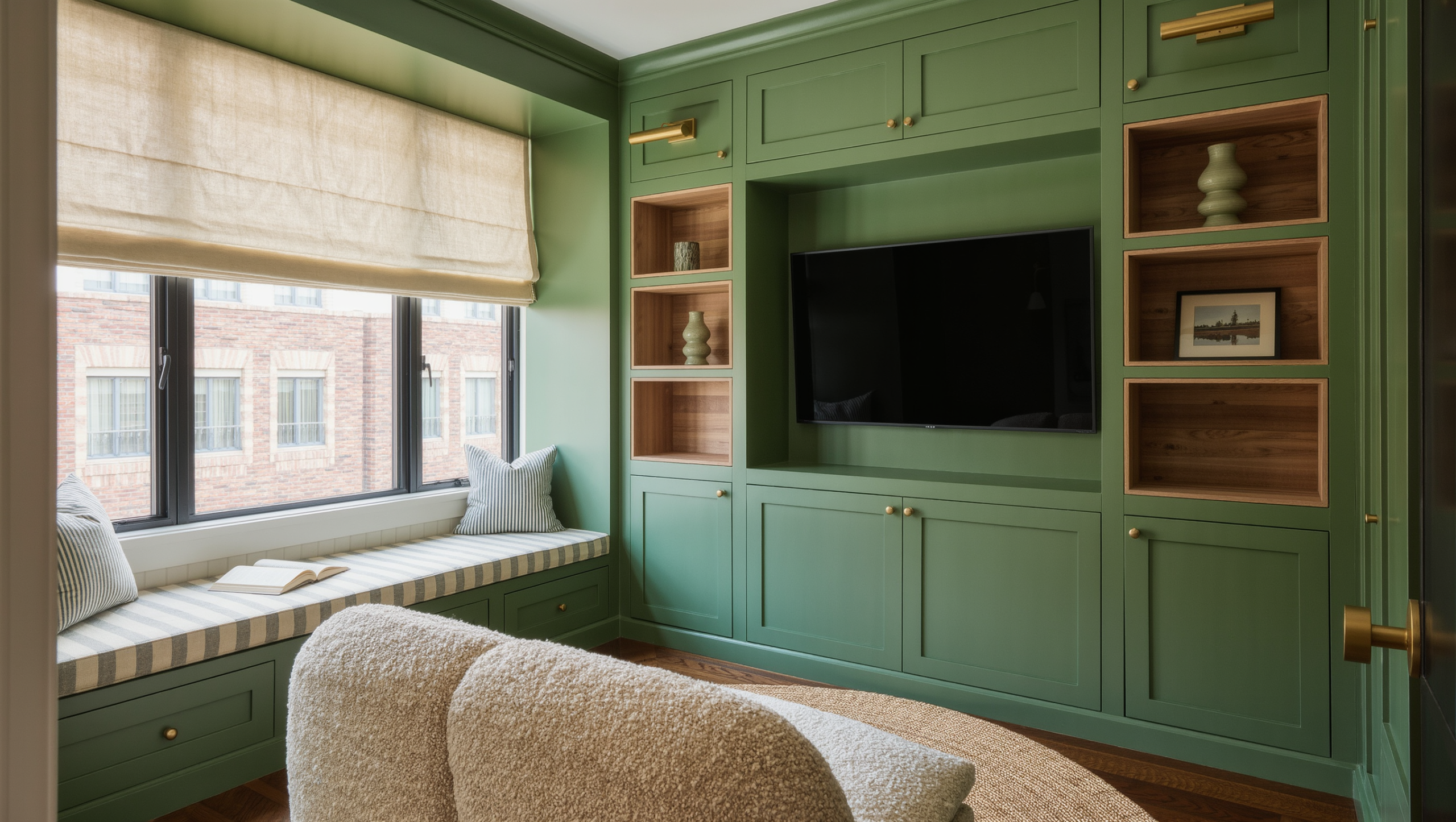
That is where a built-in earns its square footage. Closed sections take the visually loud categories. Open sections get the objects that actually improve by being seen. A bench interrupts the run. A television sits inside the composition instead of becoming the entire religion of the room. A desk can tuck into one bay and stop wandering into the dining table every Monday morning.
I am not interested in making a room look empty for the sake of looking bigger. That is not the goal. I like rooms with things in them. Good things. Weird things. Books, art, lamps, color, something with a little nerve. The trick is giving the useful ugly stuff somewhere to go so the interesting stuff gets to breathe.
Before the millwork starts flirting with you, inventory the mess
A beautiful elevation drawing will absolutely lie to you if you let it. It will show smooth doors, perfect proportions and perhaps one heroic vase. It will not show the router, board games, vacuum attachments, stacks of mail, twelve charging cords and the giant basket you actually need to fit inside.
For a week, watch the room. What lands on the floor? What collects on the table? What needs power? What needs to be reached every day? What keeps migrating because the current storage is too far away or too annoying to open?
That is the real design brief. Not symmetry. Not whether the cabinet doors would look elegant in a close-up. Storage that does not look like storage still has to hold the actual life you own.
Measuring comes next, and it is the floor you measure, not the wall. Built-ins go wrong when the elevation is gorgeous and the floor plan gets mean. Check the route with the doors open. Pull out the desk chair. Swing the bar cabinet wide. Sit on the bench. Check the sofa depth across from the wall. If the cabinetry forces every other piece into a worse position, the storage solved clutter by becoming architecture’s answer to a linebacker.
Small rooms are unforgiving about this because a few inches of depth decide whether the room reads generous or pinched. A closed drawing is not the room. The operating footprint is the room.
And be honest about the money, because nothing else in the 2026 trend list costs like this one. Built-in cabinetry is the most expensive decision in the room and the only one you cannot return. A rug that stops working gets rolled up and sold. A wall of cabinetry that stops working gets lived with, or gets a demolition bill stacked on top of the original invoice. That is the particular risk of a trend that arrives as architecture. The wallpaper leaves when you are finished with it. This does not.
A wall of identical doors can still have all the personality of an office hallway
I want more than “clean” here. Clean is fine. Clean is not a design direction.
Interrupt the cabinetry. Drop in a window seat. Leave one bay open for art. Change depth where a desk needs knee room. Use a darker back inside one niche. Bring in wood where hands touch it. Let the composition have one moment where it stops behaving and becomes interesting.
A maximalist room can absolutely have disciplined storage underneath it. In fact, it usually benefits from it. More visual character does not require more visible systems. I would rather have one substantial built-in quietly doing five jobs than five little organizers announcing their employment status.
You can fake the effect without commissioning a small yacht’s worth of millwork
Custom work is excellent when the geometry is genuinely strange, the wall has to carry several unusual functions, or you need every inch to behave. It is not the only path.
Tall freestanding units aligned tightly, painted to relate to the wall, or visually tied together with a continuous top can create much of the same calm. A bench between two cabinets can read as built-in. One strong cabinet plus a wall-mounted shelf and art can outperform an entire parade of “small-space” furniture.
The principle scales, which is important because not every good design idea needs to arrive with custom millwork and a five-figure invoice.
Strip the trend back and what is underneath it is an idea about hierarchy: one wall takes the jobs nobody came to admire, and everything else gets to be interesting. That idea is free. The cabinetry is the costume, and the costume is the part that outlasts the tenant, the taste and the decade. Buy it if you will still be standing in this room in ten years. Borrow it if you will not.
Research note: 2026 trend direction from Houzz’s 2026 home design trends and the 2026 U.S. Houzz Kitchen Trends Study.
Same problem, elsewhere in the house
Room notes
Keep the room on the record.
One useful note at a time: what to test, what to ignore, and what changed when the room got another vote.