Light and Atmosphere
Put the Paint Down for a Minute
Paint is being used to solve problems caused by layout, lighting, scale, or clutter.
On this page
13
Paint is often asked to solve problems created by furniture placement, lighting, scale, clutter, and an absent focal hierarchy. It cannot. Color can strengthen a room’s decisions. It cannot make them on the room’s behalf.
Painting first feels productive because the change is visible. It can also lock the room into a palette before its actual spatial problem has been understood.
Paint may eventually be the right move. It simply should not be the opening witness when the floor plan, light, and hierarchy have not yet testified.
Fix behavior before you reach for paint
Start with the room’s largest functional failure. Is circulation awkward? Does furniture block the useful light? Is the main activity in the wrong position? Is the storage drift so persistent that every wall reads as cluttered?
Move the sofa, clear the route, relocate the desk, or remove the unused chair before deciding the wall color. Those changes alter how much wall is visible, which surfaces matter, where shadows land, and what the eye needs the color to do.
Painting around a bad plan makes the bad plan prettier. It does not make it better.
Give color a job
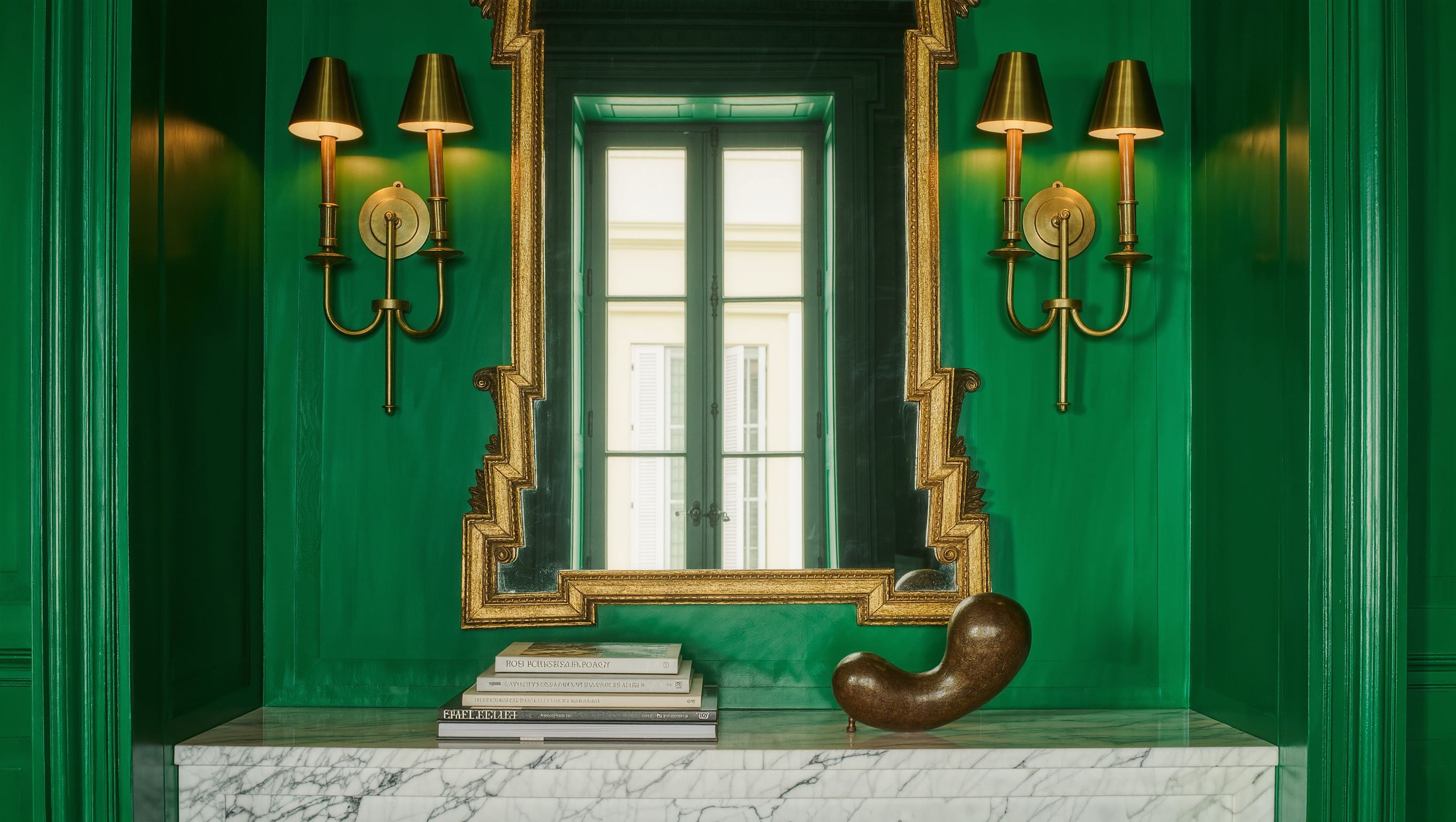
“The room needs warmth” is not yet a job. Decide where warmth is missing and what should change when the color arrives.
Color can deepen an architectural recess, connect mismatched planes, reduce contrast around a screen, make a long room feel more continuous, distinguish a work zone, hold a large piece of furniture, or give a focal wall authority.
A useful color brief sounds like this: make the north-facing room feel richer at night without fighting the oak floor; reduce the visual dominance of the television; connect the dark fireplace wall to the rest of the living room; make the dining zone read as a destination after sunset.
When the job is specific, selecting the color becomes substantially easier.
Decide what should advance and what should recede
Color changes perceived visual weight. A saturated or dark wall can bring a plane forward, make a recess feel deeper, or give an object a stronger background depending on contrast and light.
A pale wall can reflect more brightness and may also make dark furniture appear heavier. Painting the trim with the wall can reduce visual fragmentation; contrasting trim can make architecture more legible.
Choose the surface according to the room’s hierarchy. Painting every wall the same color can create continuity. Concentrating color can establish a focal relationship. Neither is automatically more sophisticated.
Settle the largest furniture first
A wall partly hidden by a sofa behaves differently from an open wall. A color behind a bed has a different job from the same color behind a desk. A dining room wall read mostly at night needs a different evaluation from a sunlit entry.
Put the largest furniture in the position you intend to keep before finalizing paint. Otherwise the room may be forced to support a palette chosen for a layout that no longer exists.
Use Layout and Flow and Furniture Scale Check if the room is still moving its major pieces around.
Test the real light
Use large samples and observe them in the morning, midday, late afternoon, and under the lamps you actually use at night. Move the sample to different walls. Corners, window walls, and planes opposite the light will not behave identically.
Test beside the fixed materials that will remain: flooring, stone, timber, tile, upholstery, cabinetry, and large art. A color selected against an isolated white screen may change dramatically when surrounded by the actual room.
Use Color Decisions That Survive Morning, Afternoon, and Night for the full sampling process.
Fix lighting before blaming the paint
A room with one cold, bright overhead source can make an excellent color look flat or unwelcoming. Before rejecting the sample, test it under the lighting hierarchy the room will use after dark.
Color temperature is only part of the issue. Direction, shade, glare, and contrast affect whether a surface looks dimensional. A wall wash, shaded lamp, or lower light may reveal the color more accurately than simply increasing total brightness.
If the room dies after sunset, solve the light system with Lighting before asking another paint chip to perform CPR.
Look at adjoining rooms
Paint is experienced through doorways as well as inside the room. Stand in the hall and neighboring spaces. The color can contrast deliberately or connect through undertone, material, or repeated accents.
Do not force every room into the same palette merely for “flow,” but make sure the transition feels chosen. A vivid room can look excellent through a calm doorway when the relationship has enough visual logic.
Sample the ceiling and trim when they are part of the decision
Ceilings receive light differently from walls. A color that feels moderate vertically can become much stronger overhead. Trim, doors, and molding can either subdivide the room or help unify it.
If you are considering color drenching, contrast trim, or a painted ceiling, sample those planes in position rather than trying to extrapolate from a wall patch.
The upper plane is too large to be treated as a theoretical footnote.
Use sheen as part of the color decision
Matte, eggshell, satin, and gloss alter reflection, depth, maintenance, and how imperfections show. The same pigment can feel different depending on finish.
Choose sheen for the surface, wear, cleaning requirements, and visual effect. Follow product guidance for appropriate locations, especially in moisture-prone or high-use spaces.
Do not use paint to conceal a building problem
Staining, damp, mold, cracking, damaged plaster, active leaks, or other building conditions need diagnosis before decorative coating. Paint can cover evidence without resolving the cause.
Likewise, do not paint over safety devices, vents, required labels, or electrical components improperly. Where repair or building performance is involved, the decorative sequence stops until the underlying issue is handled appropriately.
Sequence the work
- Resolve the primary route and major furniture positions.
- Decide the room’s focal hierarchy.
- Test daylight and evening light.
- Name the exact job of the color.
- Sample large areas on more than one wall.
- Check adjoining rooms, trim, ceiling, and fixed materials.
- Observe for several ordinary days before committing.
If construction or repair work is planned, complete dusty, damaging, or wall-altering work before the final finish. Paint should not create the illusion of completion while the room’s infrastructure remains unsettled.
When paint is the clever move
Paint is powerful once the room knows what it is doing. It can unify awkward architecture, make inexpensive surfaces feel deliberate, change perceived scale, create a useful boundary, or provide a high-impact backdrop without consuming floor space.
It is relatively reversible compared with furniture or construction, but it still requires preparation, labor, maintenance, and restoration. Treat it as a material decision rather than an emotional reset button.
Open the paint last
Paint should arrive after the room has a floor plan, a light strategy, and a hierarchy. Then color can do what it does exceptionally well: intensify a decision that already has a reason to exist.
If you cannot explain what the color should emphasize, connect, soften, separate, or recede, do not choose the color yet. The room is still asking an earlier question.
Same problem, elsewhere in the house
Room notes
Keep the room on the record.
One useful note at a time: what to test, what to ignore, and what changed when the room got another vote.