Light and Atmosphere
Color Drenching Without the Rental Paint Emergency
Renter-friendly color drenching: build an immersive 2026 palette with curtains, rugs, art, lighting, and portable color before you touch the walls.

Color drenching is having a very loud year. Zillow found mentions of it in home listings up 149% year over year going into 2026, which makes sense because a lot of us are finally tired of rooms that look like someone decorated them with a bowl of oatmeal and then lost interest halfway through. The part I actually care about for renters: you do not need ownership of every square inch of drywall to make a room feel visually committed.
I am never especially interested in a trend just because it photographs well. I want to know whether it changes how the room feels when you are actually in it. Color drenching can. Paint is one route. In a rental, it is often not the first route I would take.
Drench the things you own first
Put the biggest dose of color on the biggest movable surfaces: full-height curtains, a room-size rug, bedding, an upholstered headboard, a sofa cover that actually fits, a painted freestanding cabinet, or one enormous piece of art. A white rental wall behind all of that can stop reading as unfinished and start acting like negative space.
The timid version of the idea loses me here. Twelve tiny burgundy objects do not equal a burgundy room. If the color is supposed to own the space, give it enough square footage to behave like it belongs there. Scale wins almost every time.
That is also the expensive sentence in this post, so here is the honest version of it. Full-height curtains in a fabric worth hanging, a room-sized rug and an upholstered headboard add up to four figures, and the lease may have eleven months left on it. You do not need all of them. You need one surface large enough to change the room, and it should be the one you would take to the next address anyway. Curtains, if the windows are ordinary sizes and will be ordinary sizes somewhere else. The rug, if they are not. The rest can wait for the next lease and the room will still read as deliberate, because what makes it read that way is the size of the move, not the number of them.
One color does not mean one exact shade
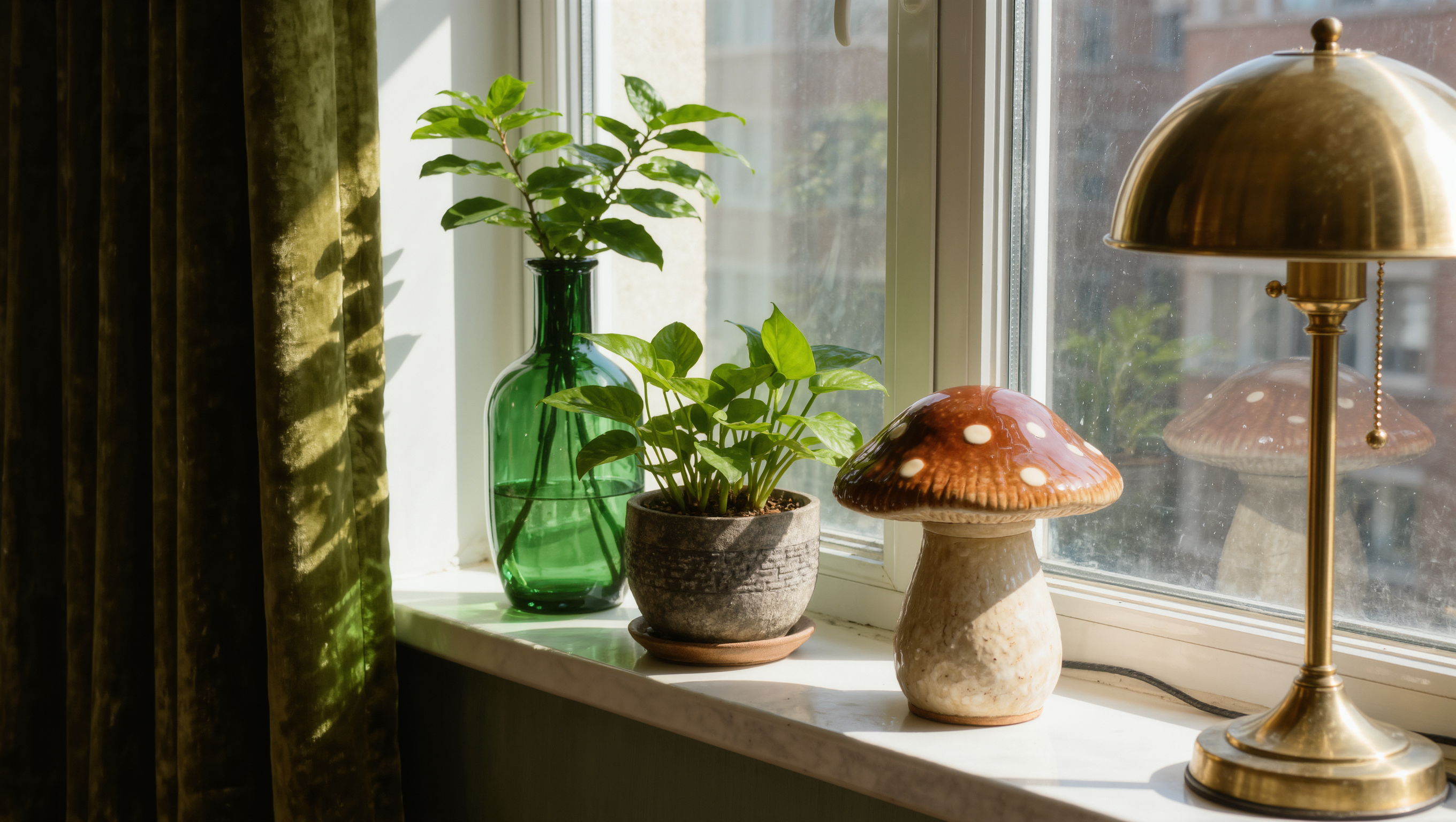
A room built around deep green can move from olive to moss to bottle glass without losing the plot. Chocolate can sit beside tobacco, mushroom, oxblood, and cream. Plum can lean smoky in the curtains and almost black in a lamp base.
That variation is what keeps the room alive. Fabric, ceramic, wood, glass, lacquer, and woven material all return light differently. Match every shade perfectly and the room can flatten itself into a paint card. Let related colors argue a little and suddenly there is depth.
Let the landlord white be useful for once
If the walls have to stay white, I would rather make that limitation work than spend an entire lease being offended by it. Use the pale shell to frame saturated pieces. Push color through the lower two-thirds of the room with upholstery, rugs, furniture, and lamps, then pull it upward with curtains, tall art, a folding screen, or a freestanding bookcase.
You can get an immersive result without touching the ceiling or trim. The eye reads repetition, proportion, contrast, and rhythm long before it checks who owns the wall.
If you are allowed to paint, do not start there anyway
Permission is not the same thing as a plan. I am always going to settle the furniture, the route through the room, and the lighting before I decide a wall color is the hero. Room for Drama already has a full argument for this in Paint Is Not the First Move, because painting around a bad layout just gives the bad layout better publicity.
Test large samples in the actual room and look at them morning, afternoon, and after dark. A deep berry that looks rich in daylight can go brown under the wrong lamp. Chocolate can look enveloping or simply exhausted depending on what is happening around it. Color is not working alone.
The kitchen can participate without losing its deposit
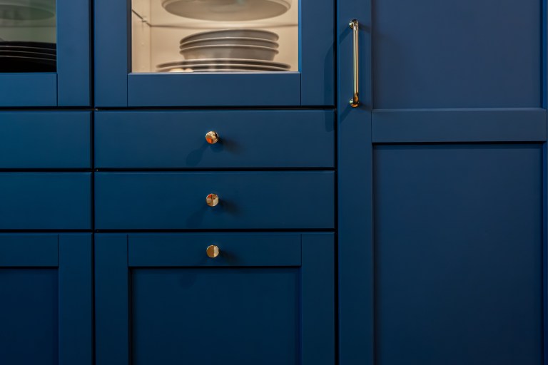
Rental kitchens are often where color gets sentenced to death. Bring the palette in through a washable runner, counter-safe objects you already use, bar stools, art where heat and moisture are not a problem, a freestanding cart, a lamp in an appropriate dry location, or cabinet hardware you are permitted to swap and can restore later.
If you are considering adhesive films, removable wallpaper, or temporary tile, treat renter-friendly as a claim to verify, not a legal guarantee. Surface age, finish, humidity, installation, removal method, and the lease all matter. The Renter-Safe Transformation Ladder is a better starting point than a social video with suspiciously perfect drywall.
Color drenching gets better when the lighting calms down
Strong color wants layered light. One bright ceiling fixture can bleach the whole idea into submission. Use portable lamps to create lower pools of light, then let the saturated surfaces carry shadow and depth instead of being lit like a grocery aisle.
The goal is not darkness. The goal is dimension. Use Lighting to build the evening version of the room, because a color-drenched space should get more interesting after sunset, not disappear.
Do not buy a new room just to follow a color trend
If the color only works when you replace the sofa, rug, curtains, bedding, art, and every lamp, I would question the color before I questioned the entire room. Start with what is already there. Decide which existing pieces can belong to the palette, which can be visually quiet, and where one or two high-impact additions would actually change the balance.
A good rental trend should survive the next address. Curtains can be hemmed again. Art moves. Lamps move. A cabinet moves. Even a very specific rug can land in a bedroom later. I like drama. I would rather it travel.
A rental does not have to look temporary just because the decisions are reversible. Temporary should describe how the design leaves, not how timidly it lives while you are there.
Source note: Zillow’s 2026 home-trends analysis reported color-drenching mentions up 149% year over year. Zillow, “Spotted on Zillow: Six Home Trends To Follow in 2026.”
Same problem, elsewhere in the house
Room notes
Keep the room on the record.
One useful note at a time: what to test, what to ignore, and what changed when the room got another vote.