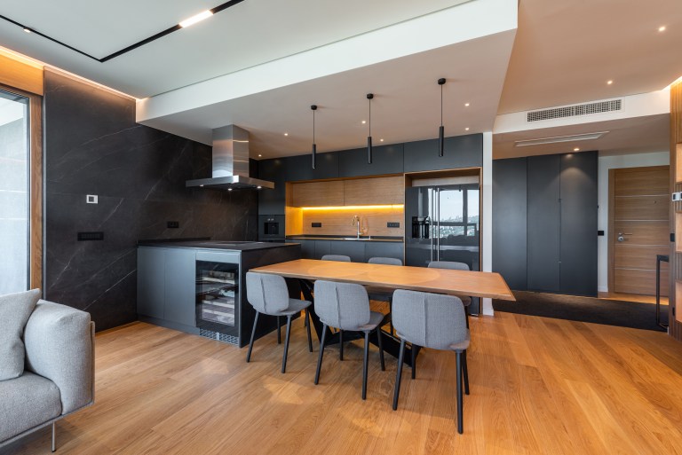
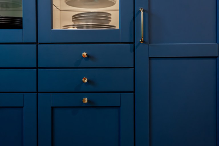
Awkward Spaces
Awkward Spaces Need One Strong Idea, Not Five Small Apologies
Solve an awkward room by identifying the geometry or function causing friction, then use one decisive layout, storage, color, or furniture move instead of many small decorative fixes.

Awkward rooms collect apologies: a tiny table because the wall is short, a basket because the corner is strange, a plant because nobody knows what else to do, three small artworks trying to convince a sloped ceiling it’s welcome here.
The room usually doesn’t need five small corrections. It needs one clear decision that explains the irregularity. Awkward architecture gets exhausting fast when every odd condition gets its own little decorative apology—the better move is deciding which irregularity actually governs the room and letting one strong solution organize the rest.
Name what’s actually awkward
Is it the route, the ceiling, a door, the fireplace, a window, an alcove, a column, a proportion, or a conflict between two of these? “Awkward” isn’t useful until the physical condition gets specific. Describe the problem as an action: the door opens into the chair; the sloped ceiling makes one wall unusable for tall storage; the off-center fireplace pulls the seating away from the best route. A precise diagnosis immediately removes several irrelevant decorating ideas you were about to fall for.
Separate visual awkwardness from functional awkwardness, because they’re not the same problem. An off-center window may look strange and function perfectly. A centered doorway may look orderly and quietly destroy the furniture plan. Functional awkwardness gets priority since it affects daily life; visual awkwardness can often be absorbed through balance, color, art, or composition once the route and furniture are actually working. Don’t spend money correcting something purely because it offends a symmetrical photograph nobody but you will ever take.
Choose the feature that can become an advantage
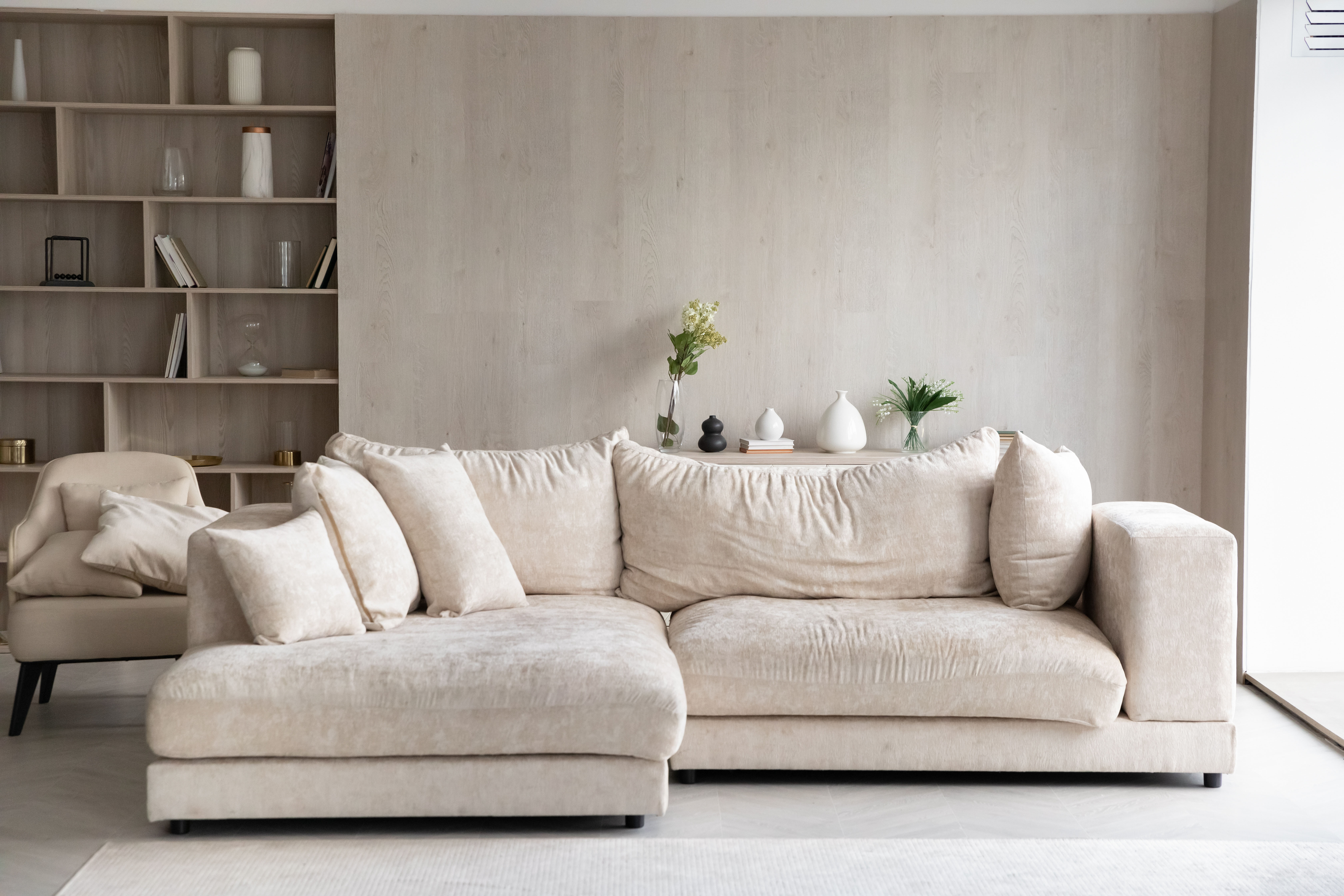
A deep alcove can become storage. A long wall can hold one substantial composition. A sloped ceiling can create enclosure. An off-center fireplace can support asymmetry on purpose. Instead of disguising the condition, ask whether it can organize the room instead. The odd feature might be the only thing keeping the space from turning generic—editing it out by reflex can leave you with a cleaner, blander, less interesting room than you started with.
Make one move with real scale: built-in-looking storage, a generous rug, one bold color field, a clear furniture axis, or a large artwork will organize the geometry more effectively than several little corrections stacked on top of each other. The move should be visible from the room’s main approach and should help a functional condition as well as the visual one. A strong move creates a new hierarchy. A weak move just announces that you noticed the problem, which nobody needed confirmed.
An irregular room often gets worse when every object is forced into symmetry—balance visual weight instead of measuring equal distances with a tape measure nobody asked for. A tall cabinet can balance a fireplace without matching its width. A larger artwork on one side may balance an architectural opening on the other. Balanced masses read as a decision. Scattered ones read as everyone in the room giving up at the same moment, which is a thing a floor plan can say out loud.
Furniture, storage, color, and light—the execution layer
Let furniture follow usable geometry: float pieces away from a strange wall if that creates a better route, use a round table where angles make rectangular placement clumsy. Only add fitted storage if access actually works—a cabinet that uses every irregular inch can still be a bad solution if half its contents become a small archaeology project to retrieve. Use color to unify or emphasize, not both at once: carrying one color across irregular walls lets the geometry read as one surface, while contrasting one plane instead turns it into a focal feature on its own. And use light to reveal the shape after dark—a lamp in a deep corner or directional light on an alcove can turn dead geometry into a destination.
Not every odd pocket needs decorating, either. A triangular patch behind a door or a narrow strip between openings may be circulation or visual relief rather than a storage opportunity—some irregular corners earn their keep by staying completely empty. (See Awkward Interior Spaces for a fuller geometry-and-conflict audit. Measure doors, moving furniture, and real bodies moving through the space—an awkward condition is not permission to reduce safe circulation, and any fixed electrical changes need qualified installation.)
Let the main view decide, then actually test it
Stand at the doorway, then from the most-used seat. Which irregularity dominates those two views? Put the strongest visual response where it changes the room’s primary reading—a beautifully resolved solution hiding in a secondary corner adds complexity without making the room feel any more finished.
Use painter’s tape, cardboard, movable furniture, or a temporary curtain to test storage depth, a furniture axis, or a color field before you commit to anything permanent. Irregular spaces are notoriously hard to judge from dimensions alone, because angles and sightlines change how volume actually feels once you’re standing in it. Live with the temporary move for several days. Open every door. Use the room at night. Let other people move through it and see what they bump into.
An awkward room becomes convincing when one strong decision explains the oddity. Five small apologies only confirm that everyone noticed the problem and nobody solved it. Name the governing condition, decide whether to emphasize or neutralize it, and let one move carry enough weight to organize everything else around it.
Same problem, elsewhere in the house
Room notes
Keep the room on the record.
One useful note at a time: what to test, what to ignore, and what changed when the room got another vote.