Awkward Spaces
Hallway Intelligence: Dead Ends, Wide Halls, and the Space Between Doors
A wide hallway can support seating, storage, books, art, or a pause point without becoming an obstacle course. Start with the circulation lane, then give the excess width one coherent secondary use.
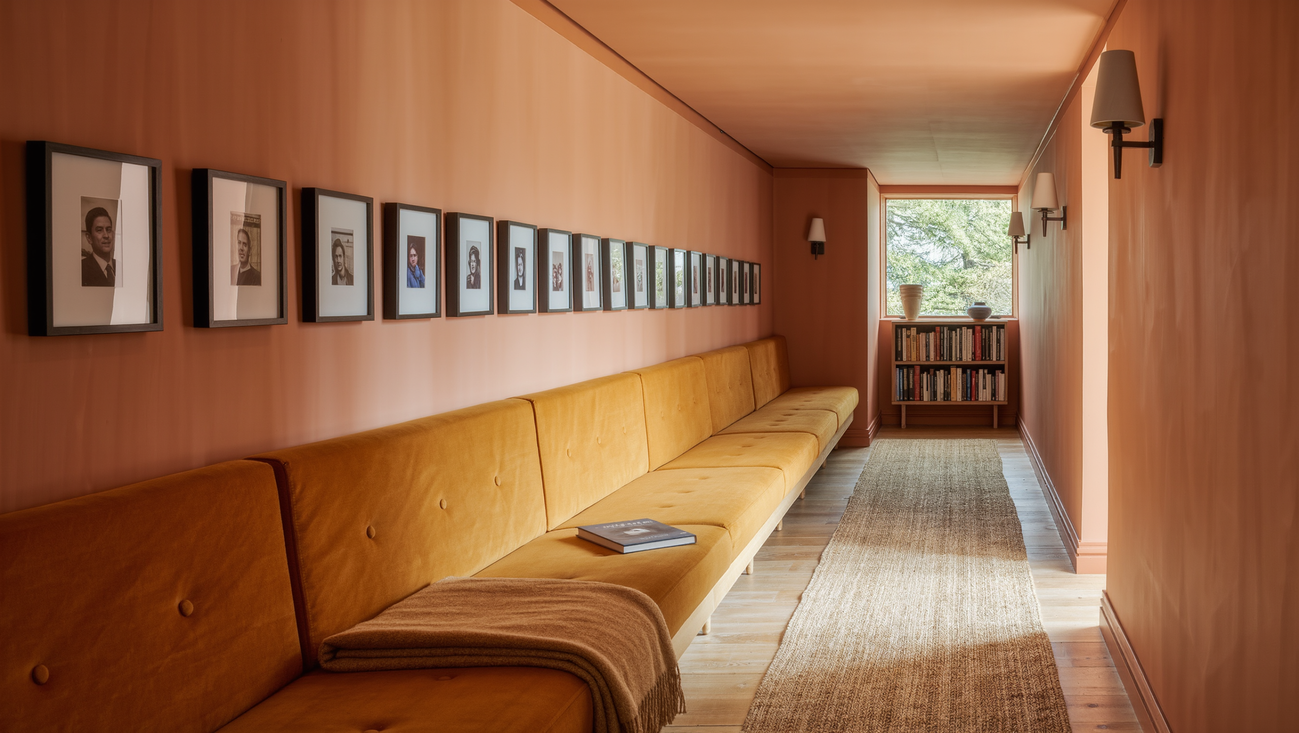
A hallway is a movement space first, with the occasional opportunity to do more—if the extra function does not punish the reason the hallway exists.
A dead end, unusually wide passage, or sliver between two doors can support art, storage, seating, a landing surface, or a visual destination. The useful move is proportional: give the hall one additional job only where circulation, door operation, light, and access can afford it.
The hallway does not need to prove its worth with furniture. Movement is already a job.
Open every door, then look at what is left

Open every door in the hallway fully, and include the person standing in it while it opens. Two doors close together generate a surprisingly large no-furniture zone even when the wall between them looks temptingly blank. Check the handles, the swing arcs, the standing space, packages, laundry, children, pets, and the route people take when they are not thinking about it. A wall can be visually available and physically unavailable at the same time, and only one of those is decided by looking at it.
Whatever survives that test is the candidate area, and the walking line through it stays clear regardless. Benches, baskets, consoles, floor lamps, and plants should not produce repeated side-steps or shave the path down for the sake of an object. Where mobility devices, assisted movement, or other access needs matter, design for the actual user and the applicable requirements rather than generic decorating clearances.
The dead end is an eye problem before it is a furniture problem
A dead-end hall reads as unfinished because the eye arrives there and has nowhere to land. Start with paint, art, a mirror, a lit wall, or a strong door — not with a cabinet. One vertical treatment produces a convincing ending and consumes no floor whatsoever. If storage genuinely is needed there, pick a depth that preserves the route and confirm the doors or drawers can open without turning the hall into a temporary barricade at the precise moment somebody wants to get past.
That end wall also governs how long the hall feels. A dark, saturated, patterned, or strongly lit endpoint acts as a full stop and pulls the far end closer; a pale or reflective one carries the eye onward and makes the passage read longer. Choose for the complaint you actually have — oppressively long, too dark, or simply unresolved — because those three want different answers, and the wrong one makes the problem worse rather than merely neutral.
A wide hall can hold a room-like moment. Not the whole width
Extra width supports a reading bench, a small library wall, a display cabinet, a work ledge, or a gallery run, provided the passage stays comfortable to walk through. Do not spend all of it simply because it is there. A wide hall usually feels generous precisely because it carries open space between rooms, and converting that into furniture buys storage at the cost of the quality that made anyone notice the hall in the first place. Give the added function a clear edge and keep the main route visually obvious.
Whatever storage does go in should belong to the rooms on either side of it. An upstairs hallway legitimately holds linens. An entry hall needs shoes and bags. A corridor by the bedrooms can carry books or laundry. What a passage should never become is overflow for unrelated categories, arriving there for the sole reason that cabinetry happened to fit.
Between two doors, go vertical or go without
Where two doors sit close together, the answer is art, color, a shallow wall-mounted object, or a light fixture. Not floor furniture, whatever the tape measure appears to be offering. Keep switches, thermostats, vents, handles, and required access clear while doing it. That wall is allowed to be a visual pause; not every surface in the house has to be storage.
Depth is the thing hallways punish hardest, because people pass within inches of the wall repeatedly, every day, frequently carrying something. A shallow console, ledge, or cabinet survives that. Deep furniture becomes an obstacle inside a week. And do not style a narrow surface with fragile objects that coats, bags, children, and ordinary movement are going to knock off it — that is a countdown.
Use lighting to change the pace
A long hall lit only by bright ceiling fixtures can feel institutional. Wall lights, art light, a lamp at a destination, or controlled pools of light can create rhythm.
Think of it as punctuation. A sconce halfway down, a lit picture at the far end, and the hall stops being a tunnel and starts being a sequence, with somewhere to arrive every few steps. The floor and the thresholds still have to read clearly, and any hardwired fixture is a job for a licensed electrician rather than a weekend.
The hallway can be atmospheric without becoming dim enough that nobody sees the turn.
Give art enough scale
Long halls tempt endless rows of small frames. That can work when the collection still reads at walking speed, but one or two larger works may give the passage stronger rhythm with less visual noise.
Place art for the walking view and the approach from adjoining rooms. A hallway is experienced in motion. Nobody lives there squared up to the wall like a museum guard.
Do not let a runner create a second navigation problem
Runners can add color, softness, and acoustic relief, but they need suitable sizing, secure placement, and relationships to doors and thresholds.
A narrow loose rug in a high-traffic route tends to creep toward the nearest door and curl a corner up at exactly the height of a sock. If the runner is staying, give it a proper pad or a secure installation suited to the floor, and if it keeps migrating anyway, the hall is voting against it.
Check the reverse view
A hallway is seen from both directions. The object that looks elegant from the entry may show an awkward side or block a sightline when viewed from a bedroom or kitchen.
Photograph from both ends before deciding the composition is finished.
Let some hallway remain only hallway
Open wall and floor can make movement feel calm and make the rooms at either end more important.
If every available wall becomes storage, gallery, hooks, bench, and display, the passage stops providing visual relief between more complex rooms.
Circulation is the part that lets the house breathe between destinations.
For a more decorative hallway treatment, continue to The Hallway Becomes a Gallery You Actually Walk Through; for geometry, use Awkward Interior Spaces.
Same problem, elsewhere in the house
Room notes
Keep the room on the record.
One useful note at a time: what to test, what to ignore, and what changed when the room got another vote.