Light and Atmosphere
The Beige Patio Has Had a Very Long Run
Outdoor color is getting richer in 2026. Build the palette around real light, planting, weather, and a few confident moves instead of defaulting to beige.

On this page
9
The outdoor room has spent enough time dressed like a very polite oatmeal.
I like a room with a point of view. That does not mean every surface needs to scream, but it does mean I am not especially interested in building a patio that looks terrified of color.
Warm, nature-driven palettes are still strong in 2026, but the more interesting shift is toward deeper, more personal color: clay, olive, rust, oxblood, tobacco, moss, mineral blue, chartreuse, aubergine, black, sun-baked pink. Good. Nature has never been beige, and I am not sure why outdoor furniture spent so many years pretending otherwise.
Adding color is the easy part. Making it belong to the light, the landscape, and the way the space actually feels is where the work is.
Outdoor light is rude, revealing, and useful
Inside, paint gets walls and lamps and controlled windows. Outside, color gets the entire sky.
Midday sun can flatten subtle tones. Deep shade can make a medium color go murky. Evening light can turn rust, ochre, and warm pink almost luminous. Snow can make black furniture look incredibly graphic. Wet stone can suddenly become three shades deeper than it was when you chose the cushion fabric.
So test color where it will live. A showroom swatch is barely a witness.
Look at it in morning shade, afternoon sun, dusk, and under whatever lighting you actually use after dark. If you only love the color for twenty minutes at golden hour, that is useful information.
Pick one color with some nerve
You do not need twelve bold colors to escape beige. You need one that is willing to do some work.
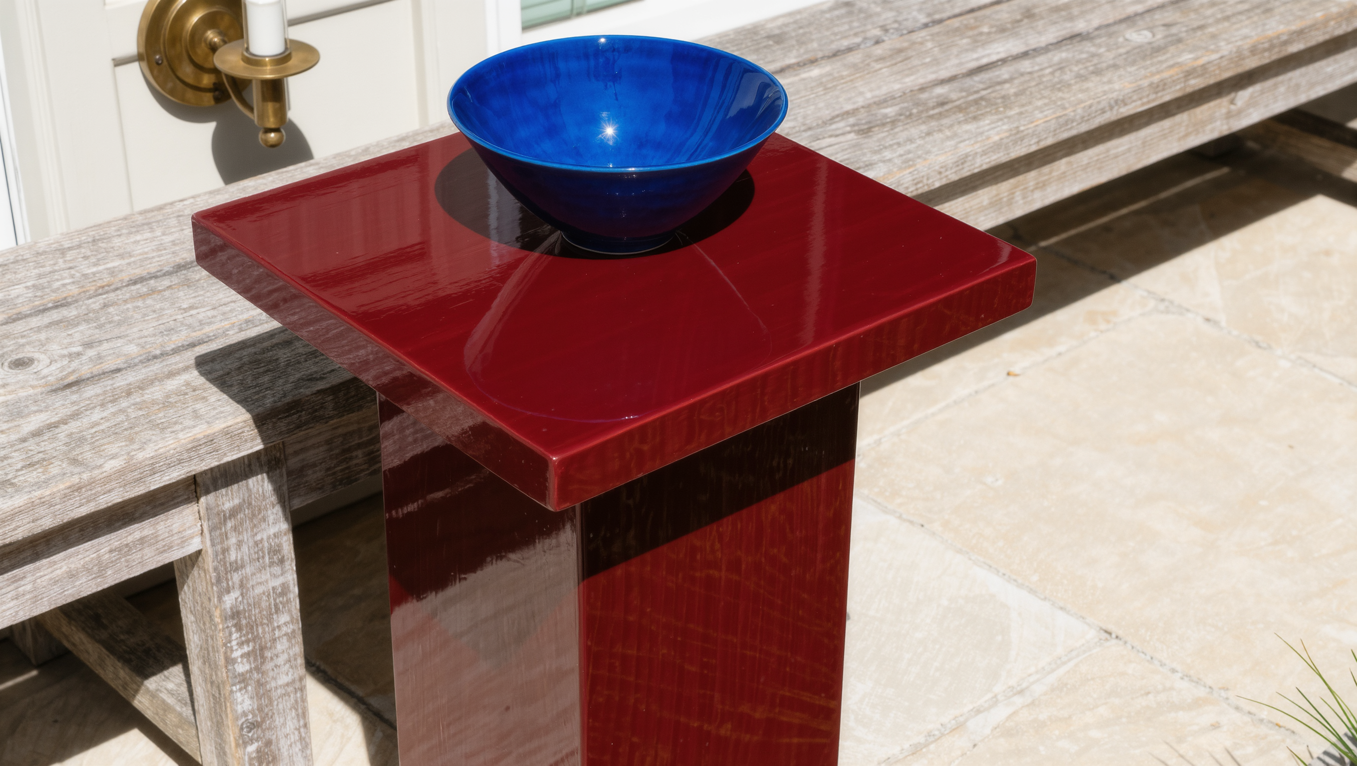
Deep olive cushions against pale stone. An oxblood side table beside weathered wood. Cobalt ceramic in a mostly green garden. Black furniture sharp enough to give loose planting a frame. Aubergine under a pergola where it can go almost brown at night.
One decisive move will always interest me more than a basket of tiny coordinating accents arranged as evidence that color occurred.
Maximalism gets a bad reputation when six loud things are arranged democratically and expected to add up to one loud thing with a reason. The big move only lands if the material around it agrees to be quiet, which is a decision somebody has to actually make.
Sage has been asked to carry this entire industry and deserves a day off
Earthy color is bigger than sage.
Think soil after rain. Bark. Lichen. Rusted metal. Dried grass. Berries. Dark leaves. New growth. Storm clouds. Clay. Wet pavement at dusk. The almost-black center of a flower. The strange acid green of a new leaf that looks fake until you remember nature made it.
Use the landscape as a palette source, not as an instruction to make everything green.
I want the colors to feel like they could have happened there even when they are clearly chosen.
Planting is already doing half the color work
Outdoor rooms have a moving palette whether you plan one or not. Flowers arrive. Foliage changes. Grasses bleach. Trees darken. Seed heads go silver. Snow erases the lower half of the composition and suddenly the fence matters a lot more.
That is not a problem. It is one of the reasons outdoor rooms are more interesting than static ones.
Build the permanent layer so it survives those changes. A rust chair can be spectacular against summer green and still hold its own in autumn. A dark screen can disappear behind July foliage and become architectural once the leaves drop.
Do not ask the cushions to provide all twelve months of personality by themselves.
Dark color can make the garden feel deeper
Black, charcoal, deep green, brown-black, and near-navy can visually recede while making plants look brighter and more dimensional. A dark fence can stop shouting about where the property ends. A black pergola can make the sky feel sharper. Dark planters can give loose greenery some discipline.
They can also get hot, show pollen, show mineral deposits, fade, or become too heavy in a shaded little courtyard.
Drama still has to survive a hot afternoon in the second week of July.
Before committing, I test. Paint a board. Move a dark chair into the area. Look at it at two in the afternoon when the sun is not being flattering. If it still works then, we are getting somewhere.
The matching outdoor set can relax now
There is something about patios that makes perfectly sensible people believe every chair, cushion, and table needs to be issued from the same collection.
It does not.
Mix solids, stripes, woven textures, a pattern with some actual presence, and one odd piece that gives the room a pulse. Repeat color in different values instead of repeating the exact same fabric twelve times. Let a vintage or sculptural piece interrupt the set if the material can handle exposure.
The room should look assembled, not assigned.
Gloss is delicious in small doses
Glazed tile, glossy ceramic, lacquer-like powder coating, reflective metal, and polished details can make outdoor color feel much richer because they catch light instead of simply absorbing it.
They also reveal scratches, dust, water spots, pollen, fingerprints, and every little weather event with admirable honesty.
I still like gloss. I just like it where the maintenance does not become a second hobby.
One glossy planter can read like jewelry. An entire high-gloss outdoor kitchen can become a full-time forensic report on who touched what.
Color should serve the mood you actually want
If the yard is meant to feel restorative, maybe the palette is deep green, smoky blue, warm wood, mineral gray, and low amber light. If it is the party space, bring in the striped umbrella, electric-blue chair, lacquered tray, flowers that are almost indecently bright, and whatever else makes the room feel awake.
Room for Drama does not require maximum volume everywhere. It requires intention.
I love dark and twisty. I love luminous. I love botanical. I love the moment a room has one slightly excessive thing that makes the rest of it make sense. What I do not love is a palette so careful that nobody can remember it five minutes later.
Give the eye somewhere quiet to land
Bold color reads better when it has contrast. That quiet place might be the paving, a wall, the largest furniture frame, or simply a broad field of green planting.
Drama needs negative space. Otherwise every surface is auditioning for lead and the production gets exhausting.
Not six pillows. One real move.
If it scares you slightly but makes the whole room wake up, that is usually more interesting than another beige cushion asking permission to exist.
Source note: 2026 U.S. Houzz Emerging Summer Trends Report.
Same problem, elsewhere in the house
Room notes
Keep the room on the record.
One useful note at a time: what to test, what to ignore, and what changed when the room got another vote.