Function and Flow
The Kitchen Found Another Room in a Drawer
A storage-and-space-intelligence reading of a compact kitchen where layered cabinetry, open pantry shelves, a protected worktop, and one pull-out table make the room work far beyond its fixed footprint.

On this page
25
Room Edit · Storage / Small-Space Intelligence / Working Kitchen
How layered storage, a pull-out worktable, open pantry shelves, and one disciplined wall make a compact kitchen cook larger than it lives.
The first read
This kitchen is strict about when space appears.
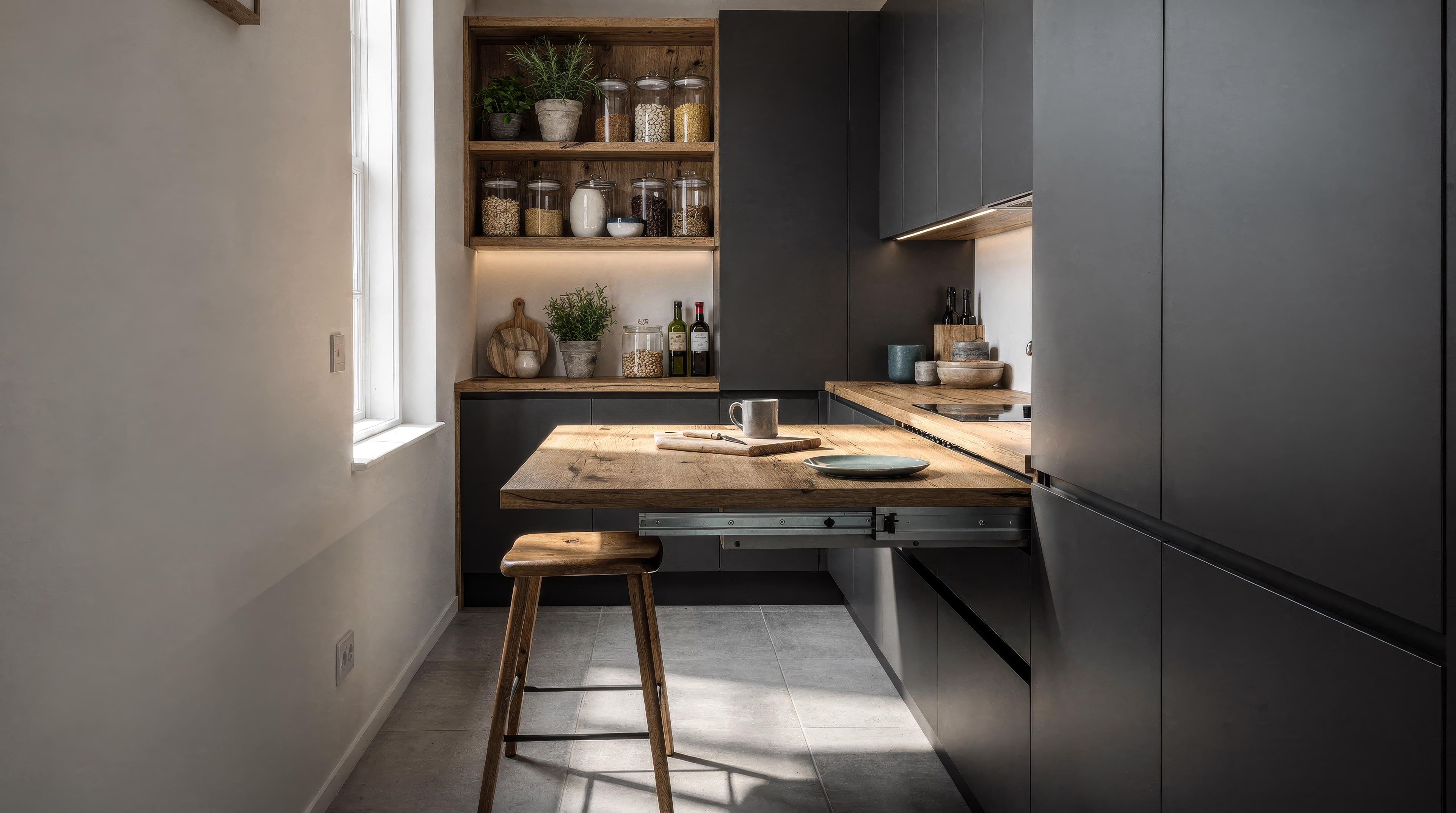
At first glance, the room looks like a handsome compact kitchen: dark cabinetry, warm timber, glass jars, abundant herbs, a mixer, utensils, pantry goods, and daylight entering from a tall window. Then the real move reveals itself. A second timber surface projects from the cabinetry, creating a table, prep extension, plating station, or breakfast ledge in territory that can presumably return to circulation when the extra plane is no longer required.
That is the room’s most intelligent decision. Instead of asking one fixed floor plan to perform every task at once, the kitchen changes state. Storage remains vertical and dense. The principal worktop stays long and legible. The secondary surface arrives on schedule. A stool waits nearby without pretending the kitchen is permanently a dining room. The room does not possess endless space; it has learned excellent timing.
The image also makes a quieter argument: good storage is not simply maximum containment. The most useful things are visible, the messiest volume is concealed, living ingredients occupy the light, and the main counter still has enough open runway to work. This is storage designed as choreography rather than a census of cabinets.
The governing idea
A working wall, a borrowed table, and nowhere for clutter to establish residency.
A strong room can usually be explained in one sentence. Here it is: concentrate storage and equipment into one hardworking wall, then borrow floor area only when a second surface earns it. Everything visible supports that sentence. Tall dark cabinets compress visual noise. Timber shelves create a pantry band. Under-shelf lighting clarifies the active counter. The pull-out table converts circulation into occupation and, crucially, appears capable of giving it back.
This is more useful than calling the kitchen “small,” “modern,” “European,” or “clever.” Those labels describe an impression. The governing sentence explains decisions. It tells us why the shelves are open, why the lower cabinetry is dark, why the worktop runs continuously, why the table is not permanently centered, and why the brightest life gathers near the window.
The transferable lesson has nothing to do with this exact mechanism: every compact kitchen should separate what must remain permanent from what only needs to exist for twenty minutes. Square footage is expensive. Time-sharing is comparatively elegant.
What the photograph proves
Visible evidence first. Kitchen mythology later.
The image shows a narrow working zone with dark base cabinetry, a continuous timber counter, a tall cabinet at the left edge, two open timber shelves, under-shelf lighting, dry goods decanted into glass containers, frequently used bottles and utensils at counter level, a stand mixer, several potted herbs, a window ledge, a radiator below the window, a projecting timber table, one stool, and an open lower niche holding tall items.
It does not show the entire plan. The sink, cooktop, refrigerator, door, full walking route, cabinet interiors, waste system, electrical arrangement, table mechanism, or exact relationship to adjacent rooms are not documented in this view. We can read hierarchy, reach, visibility, light, and likely modes of use. We cannot invent a perfect work triangle or declare a concealed drawer miraculous because we would very much like it to be.
That boundary improves the design analysis. The room is interesting because of what can be observed: vertical storage, differentiated visibility, a protected work line, a transformable surface, and a productive relationship with the window. Those principles survive even if the unseen half of the kitchen is behaving like a minor aristocratic scandal.
Storage intelligence · 01
The room stores by visibility, not merely by category.
The upper band is open and legible. Jars display dry goods, making quantity visible before the cook begins. The middle band holds tools and active ingredients close to the worktop. The lower band absorbs heavier, bulkier, less visually cooperative objects behind dark fronts. This creates a visibility gradient: handsome and useful above, active and immediate at hand level, visually noisy or infrequent below.
That gradient is more sophisticated than “open shelves versus closed cabinets.” Open and closed storage grant different permissions, which is a duller idea than opposing ideologies and a more useful one. Open storage says an object may participate in the room every day. Closed storage says an object may be useful without also joining the composition. The kitchen uses both, because demanding that every jar hide is inconvenient and demanding that every appliance perform visually is exhausting.
Before planning cabinets, sort possessions into four visibility classes: daily and displayable; daily but visually noisy; occasional and heavy; rare or elsewhere. The architecture should follow that inventory. Otherwise storage becomes beautifully proportioned real estate assigned by guesswork.
Storage intelligence · 02
Open shelves work when they behave like an index.
The glass containers are not scattered decoration. Their repeated shape creates order, while differences in contents provide variation. Because the vessels are transparent, the cook can read quantity quickly. Because the shelves are shallow and open, nothing disappears into a second row where it can spend three years becoming an archaeological ingredient.
Open pantry storage succeeds when the objects share a useful grammar: compatible container widths, stable lids, readable contents, practical reach, and enough breathing room to remove one item without negotiating with five neighbors. It fails when decanting becomes a second job, labels vanish, expiration information is lost, or beautiful jars hold ingredients nobody actually uses.
Matching jars look calm. The question is whether the shelf accelerates cooking, shopping, refilling, and cleaning. If a bag is easier to use in its original package, give that bag an honest closed home. The kitchen does not receive extra credit for making lentils change clothes.
Storage intelligence · 03
Closed cabinetry creates the visual bass line.
The near-black cabinet fronts give the room weight and continuity. Their darkness reduces the number of edges the eye must process, especially below the worktop where drawers, doors, appliances, bins, and hardware can otherwise fragment a compact elevation. The cabinets recede as one deep field while the oak worktop and shelves move forward.
This is why dark cabinetry can work in a small kitchen despite the familiar warning that every compact room must be pale. Apparent size is not controlled by brightness alone. Continuity, edge count, contrast placement, reflected light, and the clarity of the floor route matter. Here, darkness consolidates the storage mass. Warm timber and daylight keep it from becoming a sealed block.
The strategy requires discipline. If every dark door receives prominent handles, heavy molding, multiple panel styles, and high-contrast gaps, the quiet field breaks apart. Dark storage earns its elegance through consistent lines, hardware that repeats rather than competes, and enough light to reveal depth without outlining every cabinet like a police sketch.
The worktop
A counter is not storage just because objects can stand on it.
The long timber surface is the kitchen’s working runway. It holds active ingredients, herbs, oils, utensils, and the mixer, but enough of the plane remains readable for preparation. That distinction matters. Countertop storage should live at the edges of action, not occupy the action itself. A kitchen can contain generous cabinetry and still feel unusable if every horizontal surface has been conscripted into permanent display.
Map the counter by task rather than by symmetry: landing, washing, chopping, mixing, plating, hot-item support, coffee, or breakfast. Some zones may overlap at different times. Each stored object should support the zone it occupies. Oils beside prep may be logical. A mixer in the principal chopping area may not be, unless it is used constantly or can shift without ceremony.
The photograph suggests abundance without complete blockage, which is a delicate balance. The herbs and ingredients make cooking feel alive; the timber line remains visible enough to organize them. When the counter starts looking like a shelf that happens to be waist-high, storage has won a battle the kitchen cannot afford.
The decisive move
The table exists only when the room has a reason to become wider.
The projecting timber surface changes the kitchen from a single-wall workspace into a temporary peninsula. During preparation, it can extend the landing and plating area. During breakfast, it becomes a table. During baking, it may hold cooling trays or ingredients. During conversation, it gives another person a place to participate without occupying the primary counter.
Its intelligence comes from conditional occupation. When extended, it consumes circulation and therefore must earn every inch. When returned—if the visible construction operates as it appears—it restores the route. This is not furniture that performs three jobs simultaneously. It performs different jobs in sequence, which is usually the more honest form of multifunctionality.
A transformable element should be easier to operate than the inconvenience it solves. If extending the table requires clearing objects, moving several stools, unlocking obscure hardware, or lifting a surface that resents the human spine, it will remain in one position and become ordinary congestion. The best mechanism changes state in seconds and has an obvious resting place for everything displaced.
Space intelligence
Circulation is stored potential.
In compact rooms, open floor area is often treated as waste waiting for a cabinet. This kitchen proposes a better reading. The clear zone beside the main run is valuable because it can become movement, standing room, stool space, assistance space, temporary dining, or extra preparation. Empty is the wrong word for that.
The pull-out surface uses that potential without permanently canceling it. This is the spatial equivalent of a guest room that is an office most days or a curtain that creates privacy only when needed. The room does not divide every function into fixed territory. It establishes a reliable base condition and a small number of reversible transformations.
When evaluating any movable table, cart, leaf, or extension, draw both plans: stored and active. Then add real people, open doors, appliance fronts, chair pullback, carried dishes, bags, pets, and the route to the window. A mechanism is not space-saving if its useful state makes the room impossible to use.
The vertical section
The wall is doing four jobs before the floor finishes breakfast.
Reading from top to bottom, the room uses height in layers. The upper shelf stores visible dry goods and a tall plant. The lower shelf carries smaller containers and bottles within easier reach. The underside of that shelf becomes a lighting plane. Below it, the backsplash zone holds tools and active equipment. The worktop provides action. Base cabinets and the open niche absorb weight and bulk.
This vertical stacking is the reason the kitchen feels dense rather than cramped. Each layer has a different depth and level of visual activity. The shelves are shallower than the counter. Their timber backing creates warmth and definition. The darker wall around them makes the open storage read as one insertion rather than unrelated boards floating above a busy bench.
The lesson is not to fill every inch to the ceiling. High storage is useful only for objects whose retrieval frequency, weight, and access method make sense. The top shelf in a real household must respect the people using it. A beautiful jar nobody can safely reach is an ingredient with a penthouse.
Point-of-use logic
The shortest journey in the room should belong to the most repeated action.
Utensils stand near the mixer and active counter. Oils and seasonings appear close to preparation. Dry goods are visible above. Herbs gather where they can receive light and be reached. The arrangement suggests that frequently repeated actions have been given short, direct paths. This matters more than arranging storage by abstract category alone.
A point-of-use inventory asks where an object is first touched, where it is used, where its residue goes, and how it returns. The cutting board needs a path to washing and drying. The mixer needs attachments, ingredients, an outlet, and a place for the bowl. Breakfast needs dishes, food, a seat, and a rapid reset. Storage should support the entire sequence rather than merely housing the object between performances.
Run that inventory honestly and compact kitchens often turn out surprisingly efficient. Fewer steps can be an advantage when tools are placed precisely. The danger is overlap: one narrow zone may be asked to receive groceries, brew coffee, hold washed dishes, and support chopping. Name the collisions. Then relocate objects, adjust timing, or create the temporary surface that breaks the traffic jam.
The window edge
Daylight is storage infrastructure when living things are involved.
The window provides more than atmosphere. It creates a viable zone for herbs, brightens the dark cabinetry, and gives the compact room a visual distance beyond its own walls. The sill becomes a secondary ledge, but it remains closely tied to light and planting rather than becoming a random annex for objects evicted from the counter.
Plants are useful and demanding. They need light, water, drainage, trimming, and enough clearance from glass, heat, and working routes. The radiator visible below the window introduces a condition that would need real-site evaluation; the photograph does not tell us heat output, plant tolerance, ventilation, or seasonal behavior. The correct design response is observation, not a confident herb sermon delivered from one image.
Keep the window operable and the daylight path relatively clear. A crowded sill can block access, trap condensation, complicate cleaning, and reduce the very light the room depends on. Plants should make the kitchen feel alive, not establish an agricultural border checkpoint.
Light and legibility
Good storage should be visible when you need it and quiet when you do not.
The small under-shelf lights illuminate the backsplash and counter where hands work. Their placement also separates the timber shelf from the darker wall, making the storage system easier to read. Daylight handles broader illumination; localized warm light handles precision and evening atmosphere.
A compact kitchen benefits from distinct light layers: general visibility, task light on the worktop, internal or focused light where deep storage requires it, and softer light for eating or late use. Uniform brightness can make every jar, edge, and utensil equally insistent. Controlled contrast allows the room to reveal the active zone and let the rest recede.
Avoid glare on polished counters, glass containers, and metal appliances. Confirm that the cook’s body does not cast a shadow across the principal work area. The brightest object should not be the bulb itself. Storage intelligence loses much of its charm when the label is hidden behind your own elbow.
The open niche
Not every cavity needs a door, but every cavity needs a job.
The lower open compartment holds tall or frequently moved items and breaks the continuous run of dark fronts with a timber interior. It may also provide the receiving space associated with the projecting table. Whatever its exact construction, the visible lesson is useful: one open lower zone can accommodate awkward height, quick retrieval, or objects that would make a shallow drawer absurd.
Open lower storage has trade-offs. It collects dust, reveals whatever is placed there, and may be less comfortable to reach for some bodies. It should therefore hold a deliberate class of items, not become the kitchen’s final ungoverned province. Containers should fit, removal should be direct, and nothing should protrude into feet or circulation.
If the niche supports the table mechanism, that relationship should remain visually clear and operationally protected. Transformation systems fail when their resting zones become miscellaneous storage. The space required for movement is not “empty cabinet.” It is part of the machine.
The stool
A seat is spatial permission, not decoration.
The single stool tells us that the temporary surface may support one person without converting the kitchen into a permanent dining arrangement. Its round timber seat echoes the worktops, while dark legs relate to the cabinetry. It is visually simple because the room already has plenty to say.
A stool must have a credible parking place when nobody is seated. Tucking under the table, moving to a wall, or serving as a plant stand may be possible, but only one of those should be the normal reset. If it floats in the main route, the kitchen is giving up floor for a seat used for twelve minutes at breakfast.
Select by body, duration, table height, foot support, stability, and movement—not silhouette alone. A beautiful backless stool can be appropriate for short use and miserable for anything longer. The storage and space plan should admit what the seat is for. Furniture becomes clutter fastest when its job is described as “extra.”
What not to copy
The photograph is a reference, not a warrant for forty-seven glass jars.
Do not decant by reflex. Use containers when they improve visibility, freshness, handling, or fit. Preserve essential information and choose vessels that are genuinely easy to refill and clean.
Do not open every cabinet. Open storage adds visual life and fast access, but it also adds cleaning, arrangement, and exposure. Reserve it for objects that can tolerate the job.
Do not add a pull-out table without drawing its active state. The glamorous photograph is taken with the surface extended. Your floor plan must also explain the person seated there, the person passing behind, the open appliance, and the hot pan arriving from elsewhere.
Do not fill the counter to imitate abundance. The herbs, jars, ingredients, mixer, and utensils work because they belong to a kitchen in use. Decorative congestion is still congestion, even when holding artisanal olive oil.
Do not assume dark cabinetry causes smallness. Test value contrast, continuity, daylight, hardware, and floor visibility together. A fragmented pale kitchen can feel much busier than a disciplined dark one.
The storage audit
Count actions and volumes, not cabinet doors.
Begin with what the kitchen must hold: food by storage condition, cookware by weight and frequency, tableware by user and occasion, appliances by actual use, cleaning supplies, waste and recycling, linens, bottles, pet items, medicines where appropriate, and the mysterious category every household calls “miscellaneous” until it occupies three drawers.
Then record volumes and behaviors. Which objects stack? Which stand tall? Which are heavy? Which leak? Which need air? Which are used together? Which arrive in quantities larger than the chosen container? Which require two hands? Which can be stored elsewhere without turning cooking into a commute? This inventory produces cabinet types with reasons behind them.
Finally, record the reset. Where does each active object go after breakfast, baking, dinner, or grocery arrival? A kitchen is well stored when returning the room to readiness is obvious, short, and physically plausible on an ordinary tired evening. Whether everything can eventually be hidden has nothing to do with it.
The spatial rehearsal
Tape the table. Open the doors. Invite the imaginary saucepan to misbehave.
Mark the full counter depth, projecting table, stool position, cabinet openings, appliance doors, and principal standing zones on the floor. Use cardboard or a temporary table at the proposed height. Rehearse food preparation, serving, seating, clearing, loading, and passing through. One diagram is helpful. Twenty minutes of bodily evidence is better.
Test the kitchen in both states. In compact mode, confirm the route is generous enough and the table has a true resting position. In expanded mode, confirm that the added surface supports a valuable activity without disabling another essential one. If the refrigerator or dishwasher cannot open while breakfast exists, decide whether that timing conflict is acceptable or ridiculous.
Include other bodies. A left-handed cook, child, tall person, seated person, visitor, or person carrying a tray will reveal different conflicts. Accessibility is not a decorative checklist added after the cabinetry order. It begins by asking who can reach, grip, see, move, sit, turn, and participate in the proposed room.
Three ways to build the idea
Custom mechanism optional. Spatial discipline mandatory.
The furniture version: use a narrow mobile table, drop-leaf table, gateleg piece, nesting surfaces, or a counter-height cart with a precise parking place. Pair it with closed lower storage, one well-edited open shelf, strong task light, and a protected counter zone. This approach can suit renters and rooms where permanent cabinetry is not justified.
The retrofit version: introduce a pull-out, fold-down, or sliding surface within an existing run only after verifying clearances, cabinet strength, hardware capacity, and the active route. Reorganize adjacent drawers so the table supports a specific zone rather than appearing wherever a cavity happened to exist.
The integrated version: design the working wall, pantry band, lighting, appliance positions, transformable surface, stool storage, and material transitions as one composition. The mechanism should feel inevitable, serviceable, and replaceable. Hidden complexity is allowed. Mysterious complexity that nobody can repair is merely future cabinetry folklore.
All three versions should preserve the same principles: concentrate permanent storage, protect the principal worktop, create extra surface only when needed, give movable parts a complete resting state, and make the daily reset easier than leaving everything out.
Material and color
Graphite makes the room quiet. Oak makes it edible.
The visible palette is compact: graphite-black cabinetry, smoky gray walls, warm oak shelves and worktops, clear glass, stainless steel, ceramic neutrals, herb green, and small notes of food color. Because the architecture is restrained, tomatoes, leaves, oil, grain, and pottery become the changing accents. The kitchen looks alive without requiring the cabinets to perform a seasonal cabaret.
A practical interpretive palette: charcoal #1A1D1B; softened black #272B28; warm oak #C69A61; oat #D8C8AE; porcelain #F4EEE4; herb #486047; olive shadow #344338; and tomato #B94D36. These colors describe the image’s design logic rather than claiming measured finishes.
Use the dark field for continuity, oak for touch and warmth, pale ceramics for functional contrast, and food or plants for the most saturated notes. Repeating oak at shelf, counter, pull-out surface, and stool seat connects the transformable parts to the permanent room. Material repetition is doing the work that extra ornament would only interrupt.
Budget intelligence
Spend on the parts touched every day and the mechanism that must not become a grievance.
Prioritize durable work surfaces, reliable drawer and door hardware, useful task lighting, comfortable handles, the storage interiors that solve real volume, and any moving table mechanism. A beautiful front cannot compensate for a drawer that resists, a shelf that wastes depth, or a surface that stains when someone cooks with conviction.
Economize on perfect visual matching inside every cabinet, excessive specialty organizers, decorative containers, and secondary accessories. Standard bins or boxes can be excellent when dimensions are recorded. Existing jars can be unified through placement rather than replaced as a ceremonial set.
If the budget contracts, preserve the continuous work zone, point-of-use storage, clear route, good light, and one reversible extra surface. Delay new fronts, custom cladding, elaborate decanting, and display objects. Storage earns money when it removes friction. It merely spends money when it photographs its own organization.
Across one ordinary day
The kitchen changes scenes without changing its identity.
In the morning, the pull-out surface can host one seat, breakfast, a laptop kept safely away from active prep, or the day’s first ingredients. Dry goods are visible. The window brightens the herbs. The principal counter remains available for the work breakfast creates.
At midday or during baking, the surface becomes overflow: trays, mixing bowls, cooling, plating, or a second pair of hands. The stool leaves the active route. Frequently used ingredients descend from the shelf and return without opening a procession of cabinets.
In the evening, the table can hold finished plates or allow someone to sit near the cook without standing in the central work zone. After use, dishes move onward, ingredients return to their visible index, tools return to point-of-use storage, and the surface retracts or clears. The room becomes compact again—not because nothing happened, but because everything has an exit.
The ten-minute reset
Storage proves itself after dinner, not during the installation photograph.
A credible reset begins with destinations. Active utensils return together. Oils and seasonings move a short distance. Dry goods go back to their readable shelf. Waste and compost are reachable without crossing the cook’s route. Small appliances either earn permanent counter territory or have a storage path that does not require weightlifting from an inconvenient cave.
The pull-out table should clear in one pass. Nothing should live on it merely because it is horizontal. The stool returns to one predictable position. The worktop is wiped from the cleanest zone toward the messiest. Lighting can then shift from task brightness to a softer evening state, allowing the kitchen to remain present without continuing to announce unfinished labor.
If reset requires decanting leftovers, relocating décor, rearranging jars, finding lids, moving the mixer twice, and negotiating with a table mechanism, the system is not complete. It has hired the occupant as unpaid facilities staff.
Definition of done
The kitchen is complete when every square foot knows whether it is permanent, temporary, or gloriously free.
The storage plan holds the household’s real inventory. Daily objects have short, direct routes. Heavy and noisy items have appropriate homes. Open shelves remain useful rather than ornamental. Closed cabinetry reduces visual noise without making retrieval mysterious. The principal counter contains enough open length to support actual food preparation.
The secondary surface creates a meaningful new mode and restores circulation when that mode ends. Its mechanism is easy, stable, and compatible with the room’s real clearances. The stool parks. Doors and appliances operate. The window remains usable. Plants can be maintained. Light reaches the work without glare or body shadow.
Most importantly, the room feels abundant rather than overfilled. It allows cooking to be visible, generous, fragrant, and a little unruly without surrendering to permanent clutter. The kitchen has not discovered more square footage. It has discovered that space can keep appointments.
Final direction
Do not ask the small kitchen to hold everything at once.
Give permanent space to the functions that are truly permanent: core storage, reliable worktop, essential equipment, light, and circulation. Give temporary space to breakfast, extra preparation, baking, serving, conversation, or work. Give visual space only to objects willing to contribute order, appetite, or life.
The photograph’s charm comes from herbs, jars, timber, dark cabinetry, and generous signs of cooking. Its intelligence comes from a stricter place: layers, reach, sequence, transformation, and reset. That is why the room feels rich rather than merely crowded.
The cleverest object may be the table that appears from the cabinetry. The better achievement is the discipline around it. The kitchen knows exactly what must stay, what may come out, and what should disappear before clutter begins forwarding its mail.
Drawer as room: Small Spaces, Full Personality. The drawer and landing pieces: Objects That Change the Room. Volume, reach, and reset: Space Intelligence.
Same problem, elsewhere in the house
Room notes
Keep the room on the record.
One useful note at a time: what to test, what to ignore, and what changed when the room got another vote.